THE BRIEF
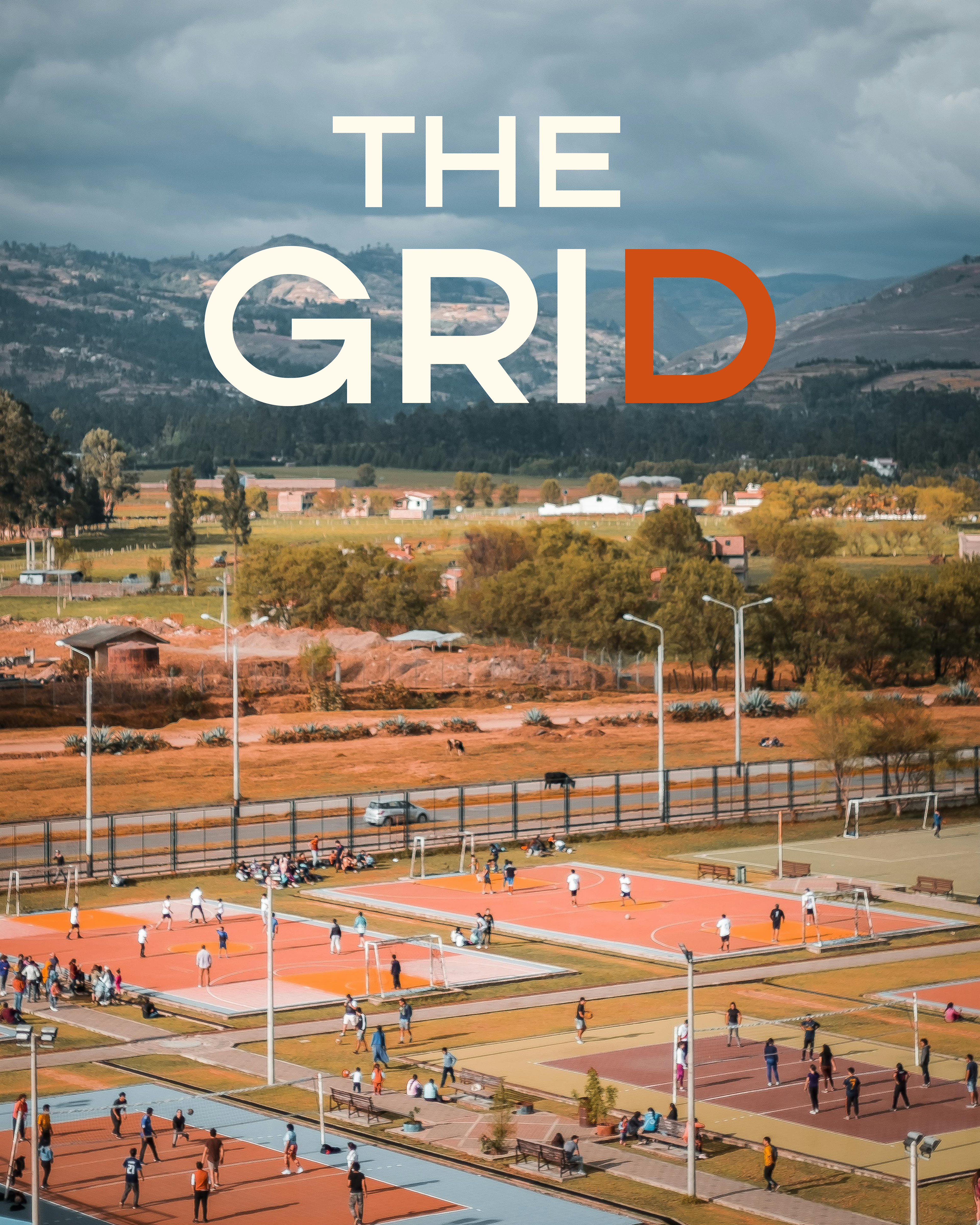
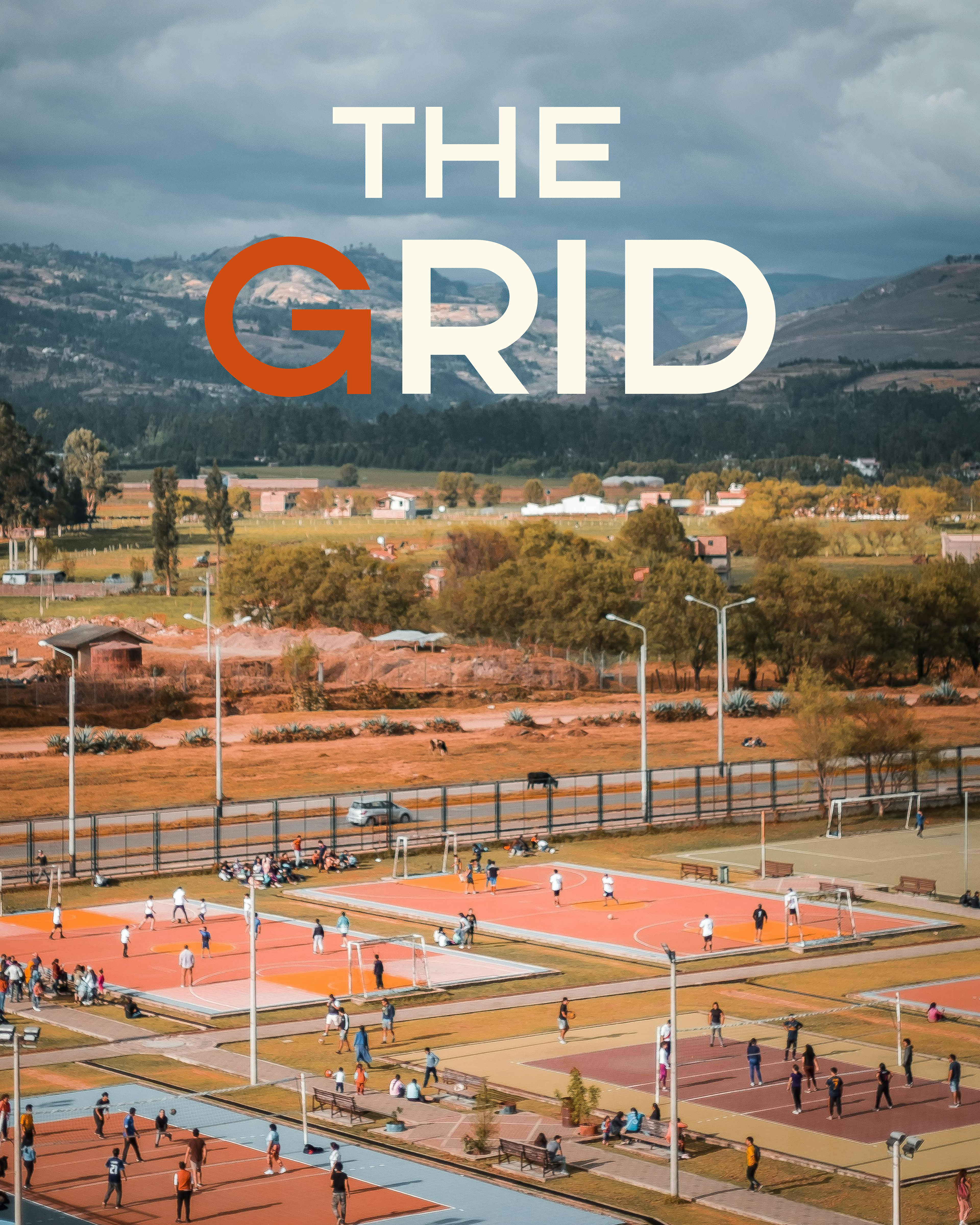
Responsive Logo: Primary, Wordmark & Icon
Colour Palette
Typography Suite
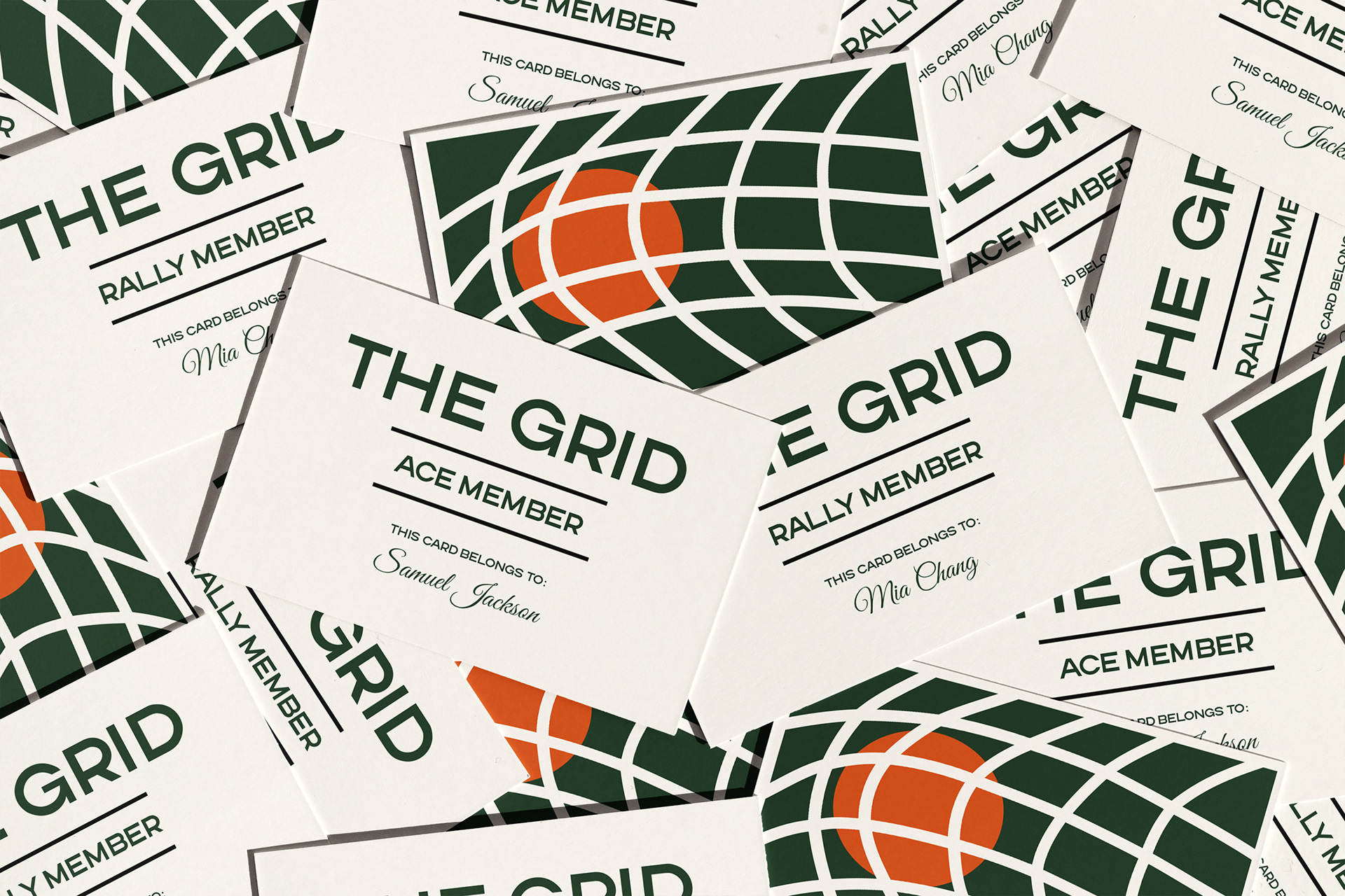
Members Card & Loyalty Card
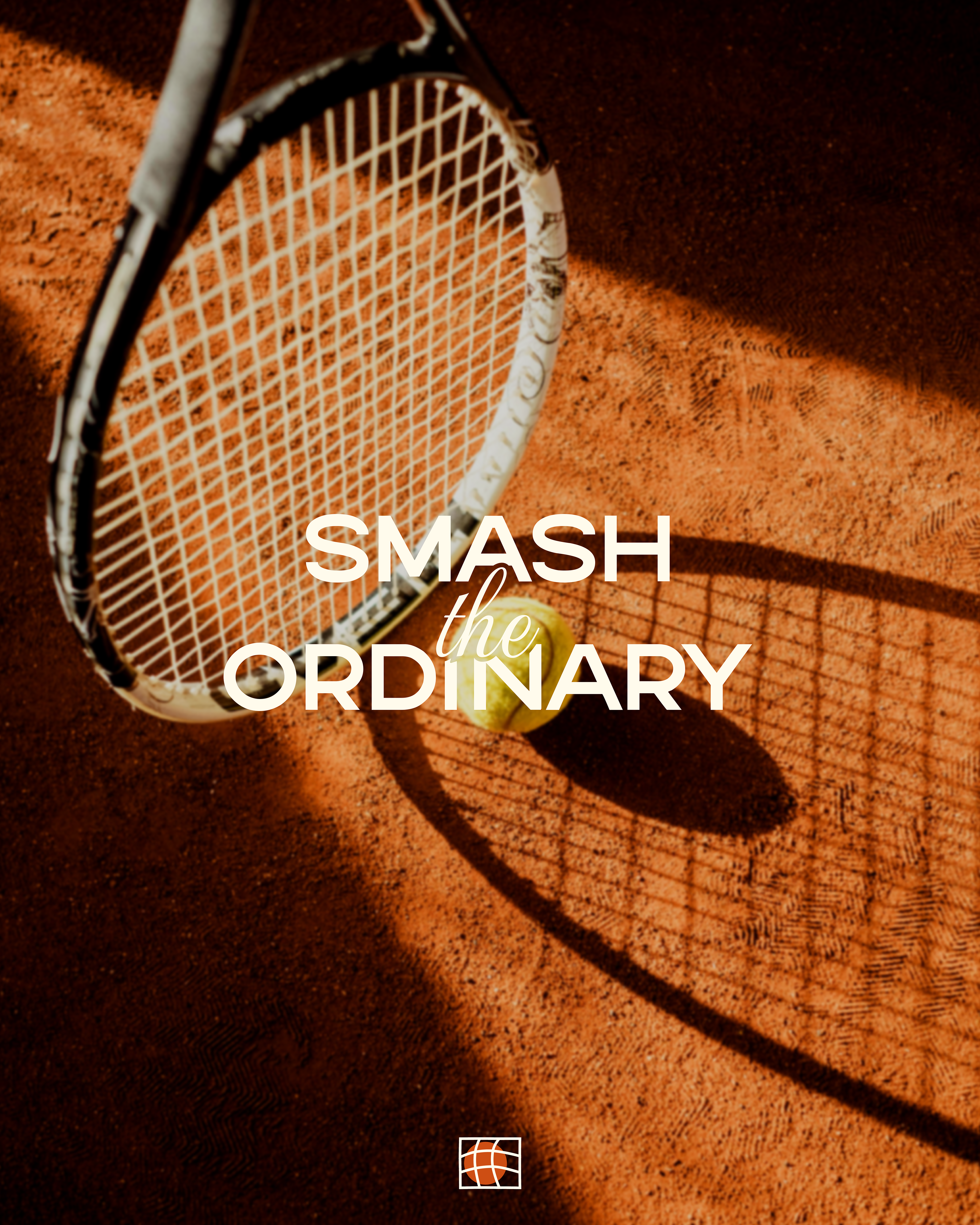
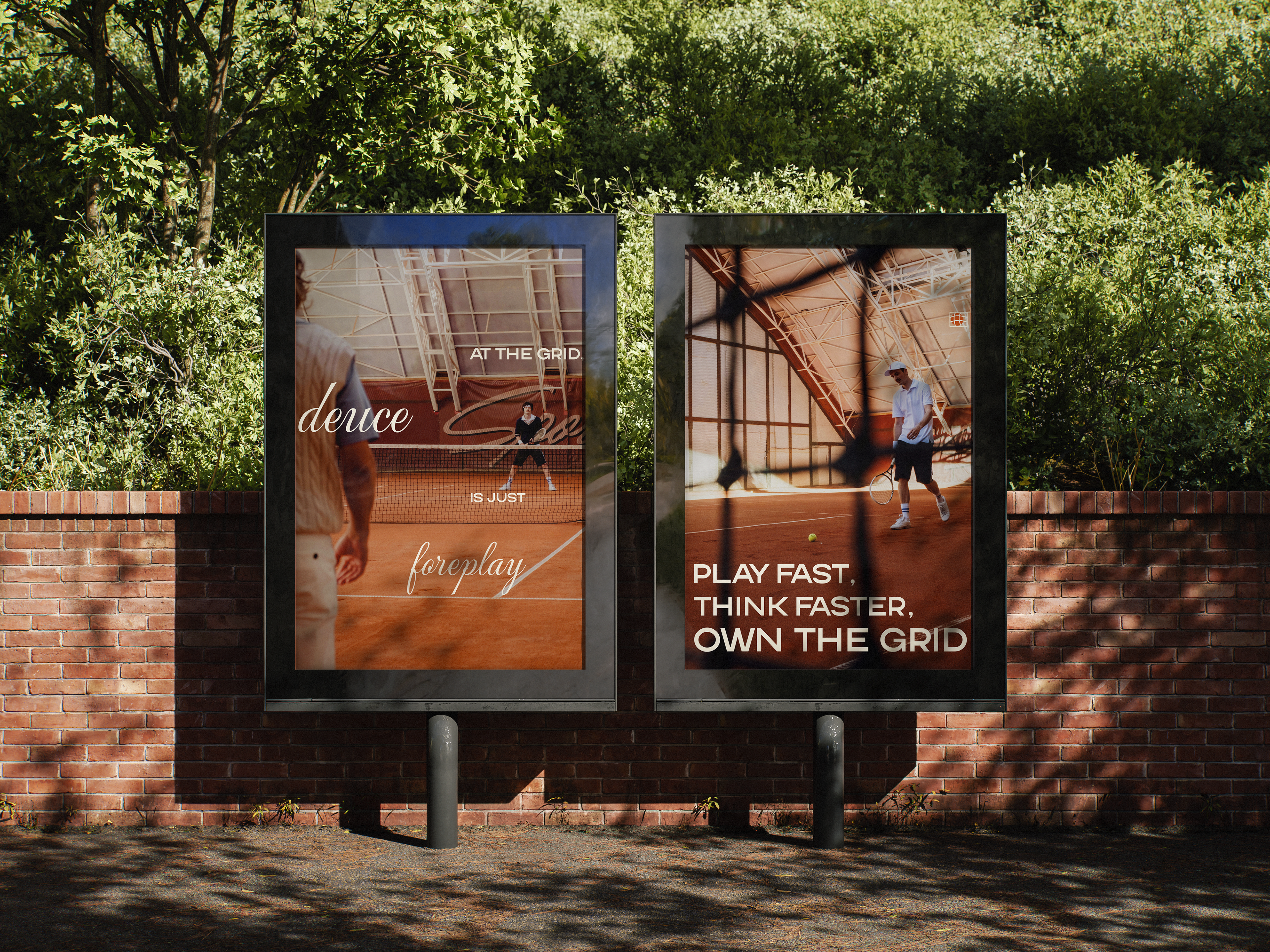
Posters (EXTRAS)


What is the logo?
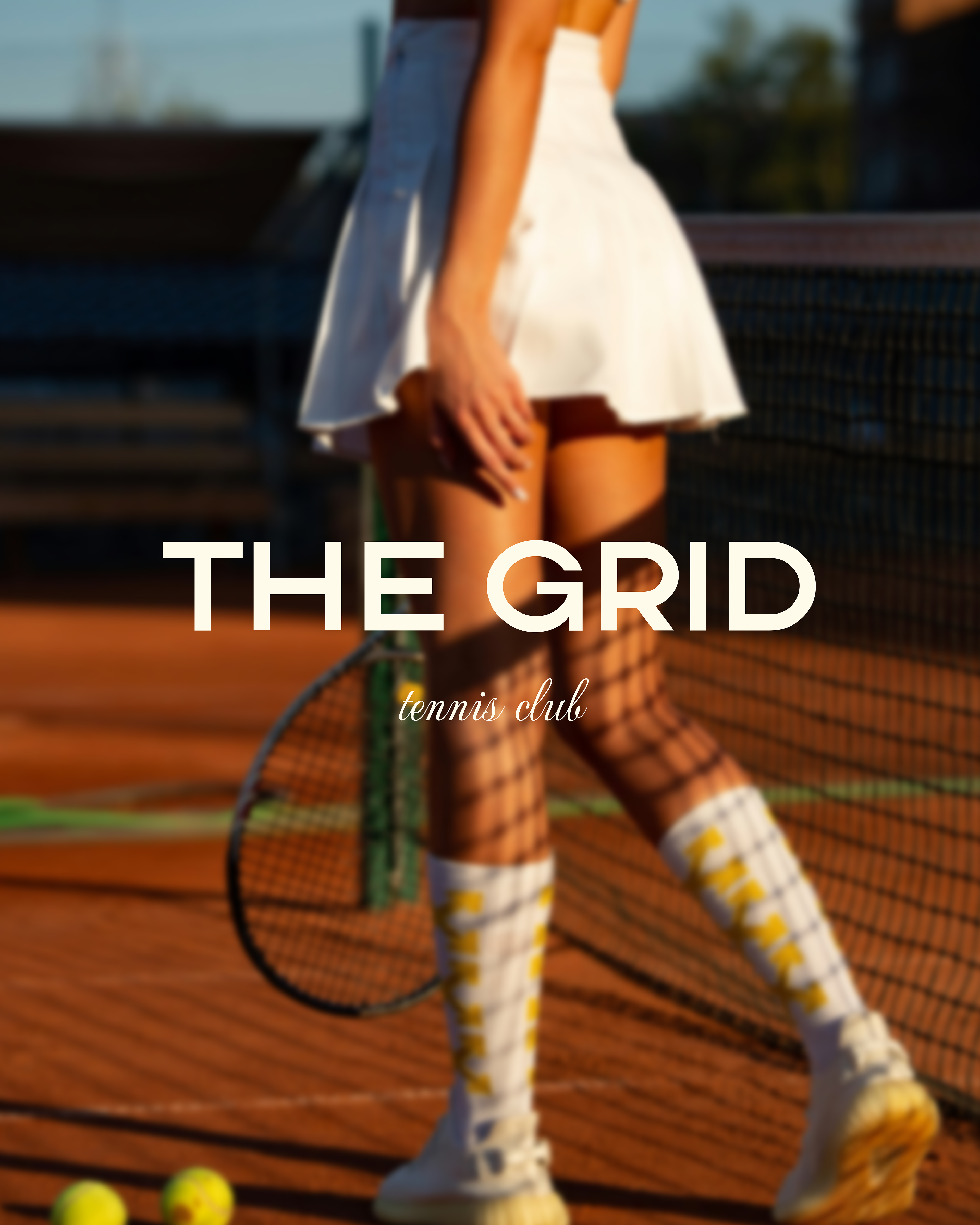
Since tennis is a sport defined by speed, tension, and split-second decisions, I wanted the logo to capture that energy. There’s no moment more intense than when the ball strikes the net because, in that instant, victory or defeat hangs in the balance.
What better way to capture this feeling than highlighting this moment and using this as the core inspiration for the logo? To deepen the connection between the club’s identity and the logo, I incorporated a 3x3 square to create a literal link between the name and the icon.

Colour Palette
This colour palette captures the heritage, energy, and elegance of the tennis club. It blends natural greens, warm neutrals, and bold accents to create a timeless and dynamic identity that appeals to both competitive players and social members. The orange injects energy, action, and excitement that are essential qualities in a sport like tennis as well as representing the clay courts used in major tournaments (like the French Open).
Additionally, a soft neutral shade brings a sense of balance and lightness to the brand identity, preventing the overall design from feeling too heavy or dark. Its versatility also allows it to work well across different applications, from printed materials to digital branding, maintaining a cohesive and elegant look for the tennis club.