The Brief:
Menu Redesign
Mascot/Illustration
Current Menu
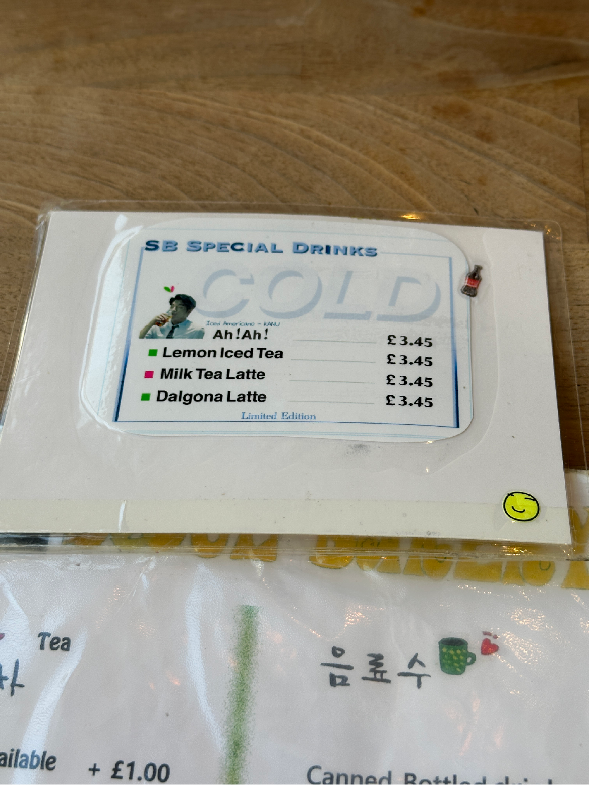
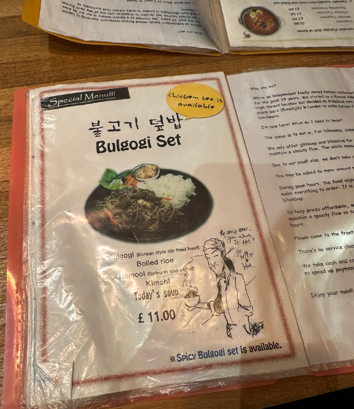
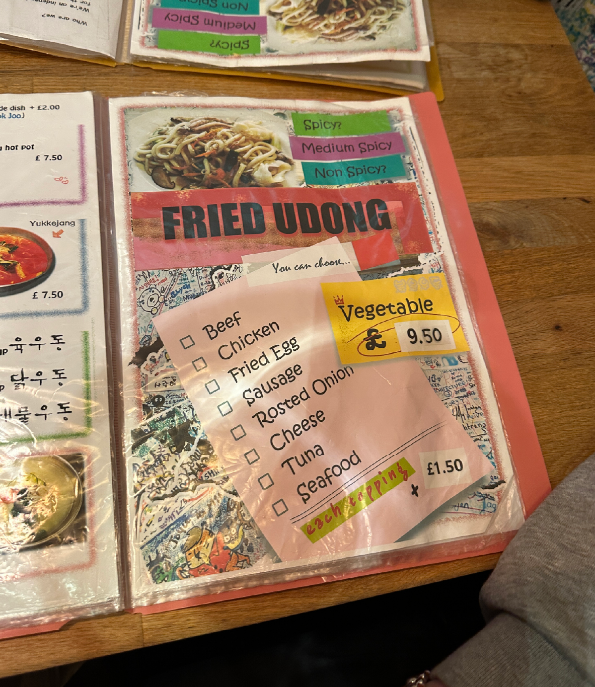
The current menu design at Seoul Bakery doesn’t reflect the brand or the experience it offers. While the food speaks of tradition and authenticity, the menu feels overly colourful, cluttered, and lacks a clear structure. This kind of disorganisation can make it difficult for diners to find what they’re looking for and may even discourage them from exploring other dishes. Inconsistencies in design throughout the menu, along with the presence of the old logo, really highlight how long it’s been since any meaningful updates were made.

Outside the Restaurant

Page 1
Page 1
Page 2

Page 3

Page 4
Page 5

Page 6
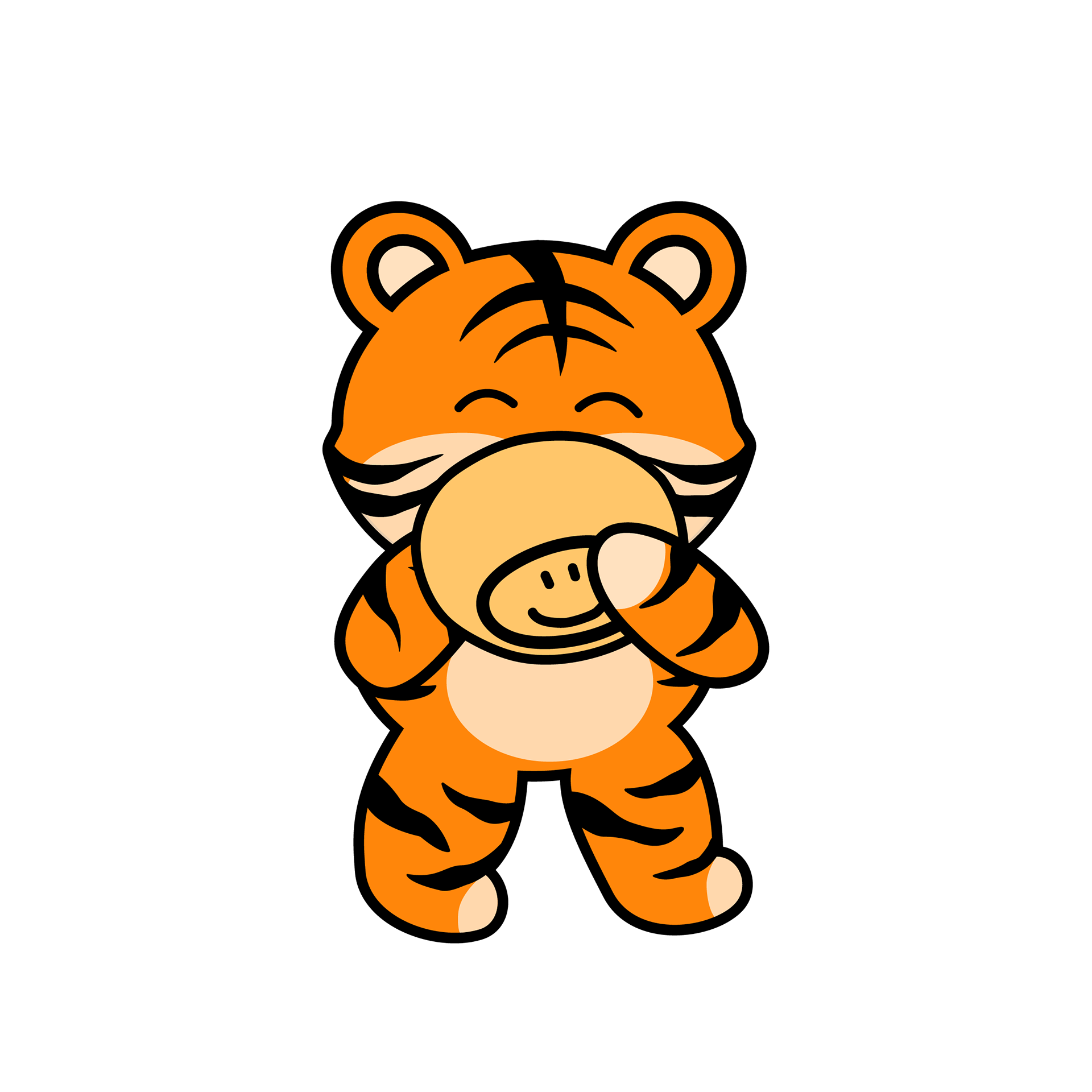
Why a Tiger?
Historically, the tiger has deep roots in Korean culture, folklore, and art, hence why it is known as their national animal. It’s often seen as a symbol of strength, courage, and protection, but also sometimes as a playful guardian. This mascot can be used throughout their social media, stationery assets & stickers to be sold or given to returning customers.


New Menu Design
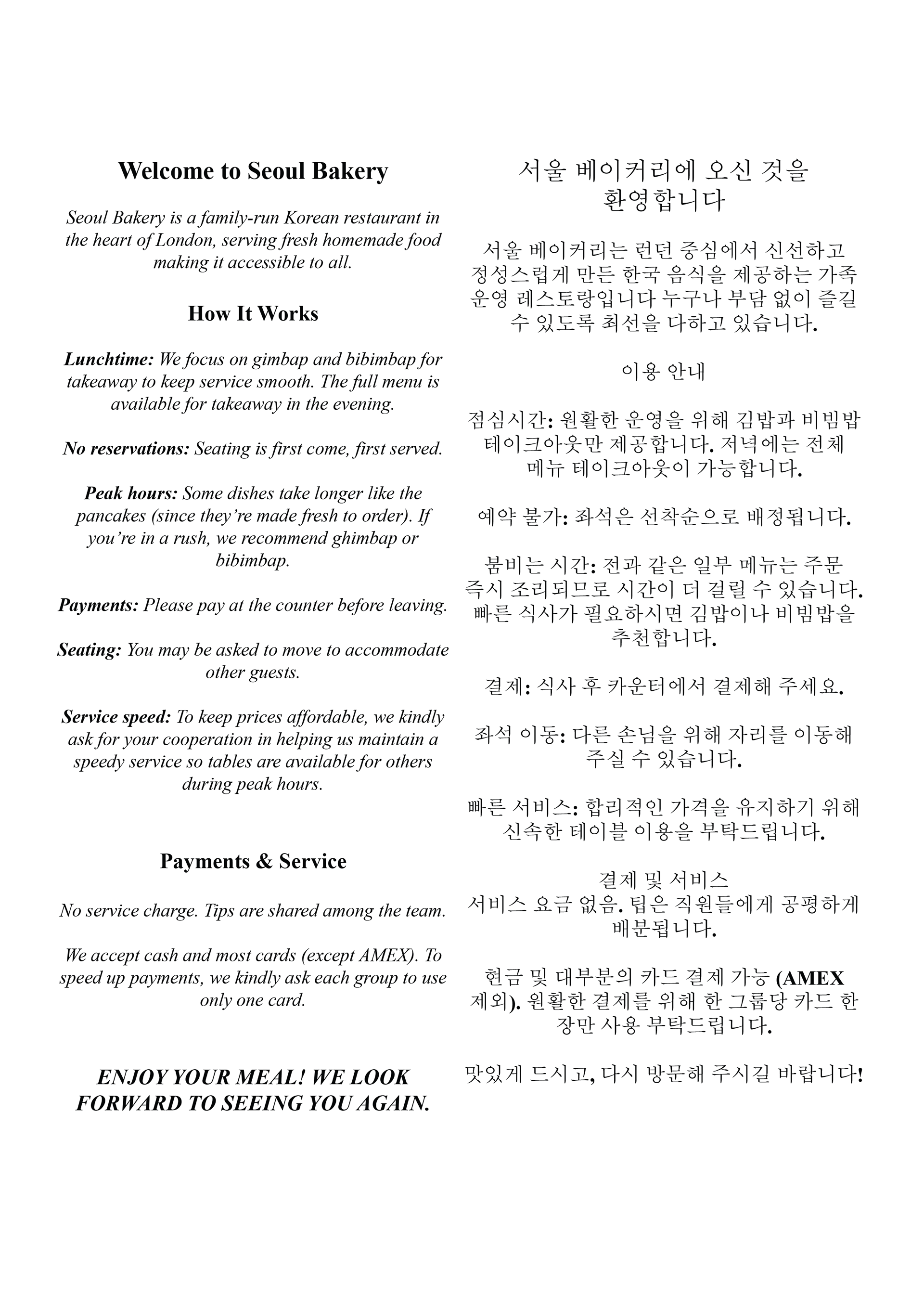
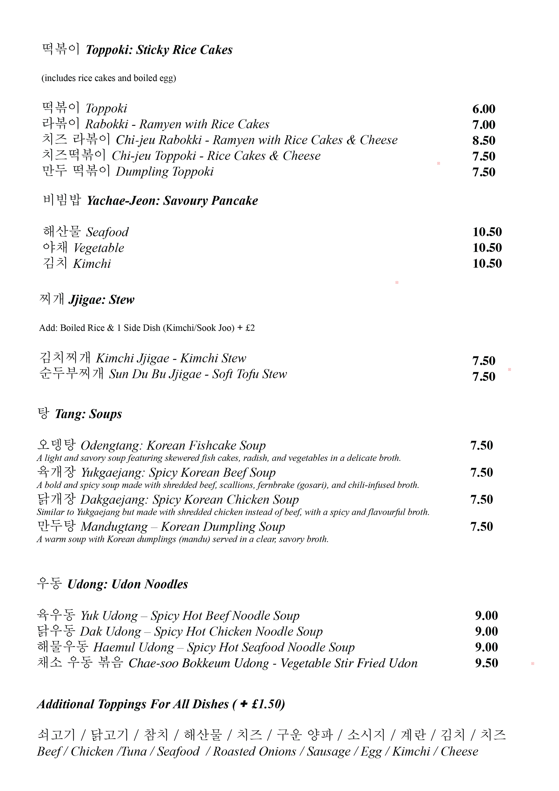
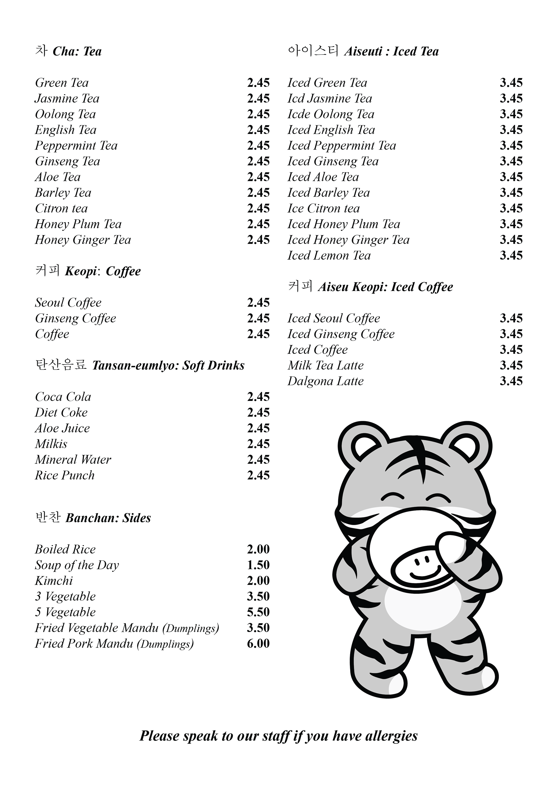
The new menu design is much more aligned with Seoul Bakery’s current branding and identity. It features a clean, simple layout that makes it easy to read and navigate, allowing the food to take centre stage without distraction.
Incorporating more Korean language throughout the menu brings a deeper cultural connection to the experience, helping to evoke the feeling of actually dining in Korea. Including both Hangul and English not only adds authenticity but also makes the menu more inclusive, welcoming Korean-speaking guests while introducing non-Korean diners to the language in a natural, engaging way.
Additionally, the playful use of the tiger mascot throughout the design helps reinforce brand recognition. Over time, customers will begin to associate the tiger with the warm, homemade flavours of Seoul Bakery, creating a stronger emotional connection to the restaurant.
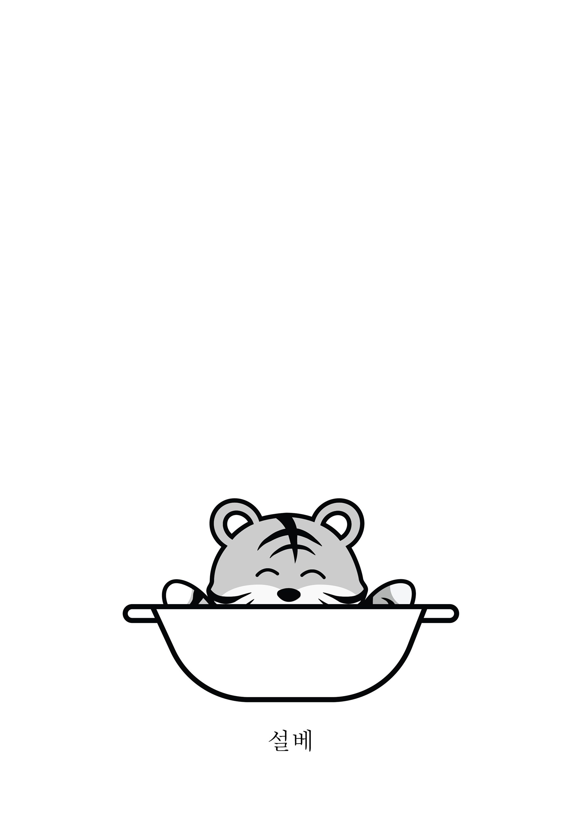
Front Page
Page 1

Page 2
Page 3
Page 4
