The Brief:
Name of Business
Responsive Logo: Primary, Secondary & Icon
Colour Palette
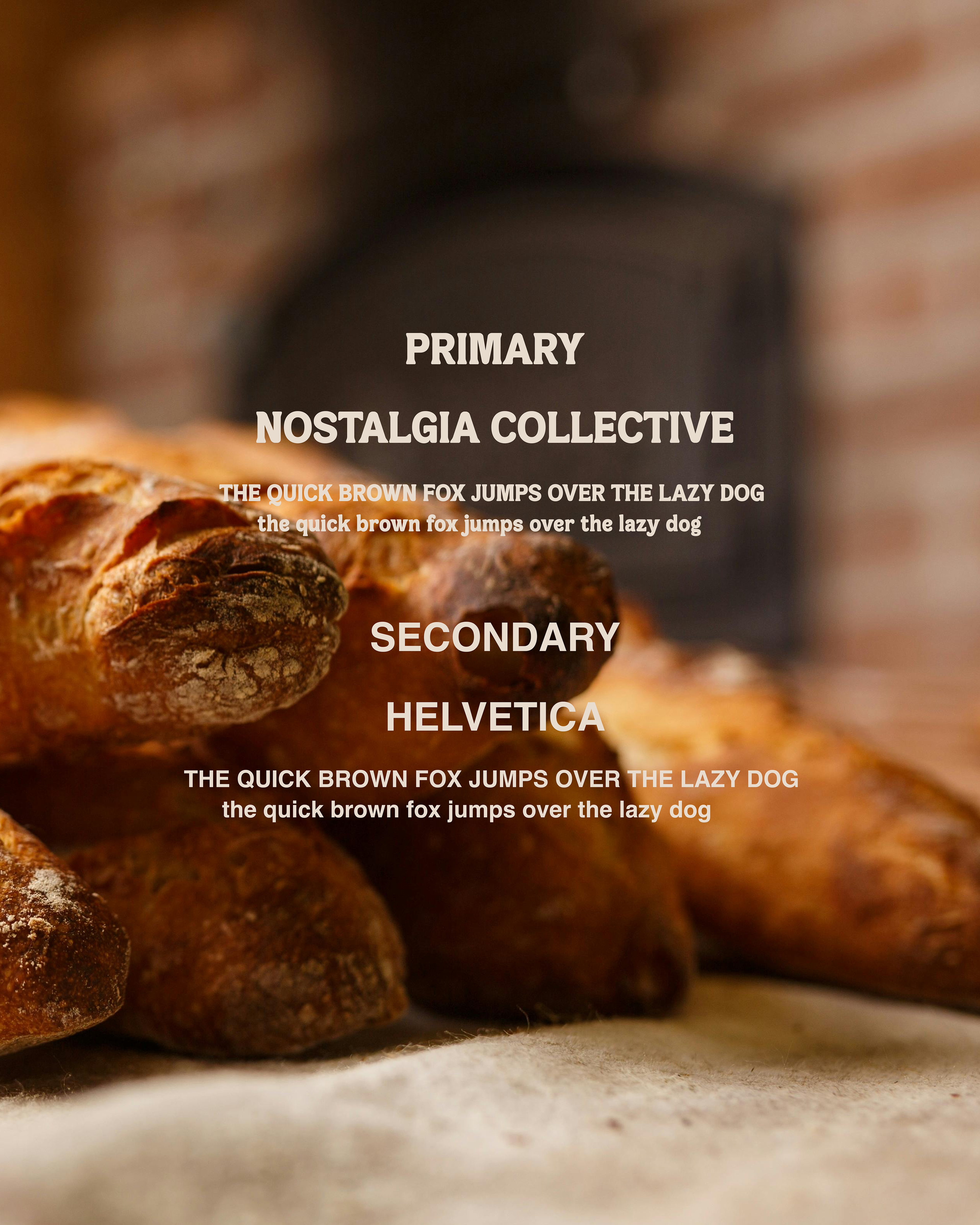
Typography
Mascot/Illustration
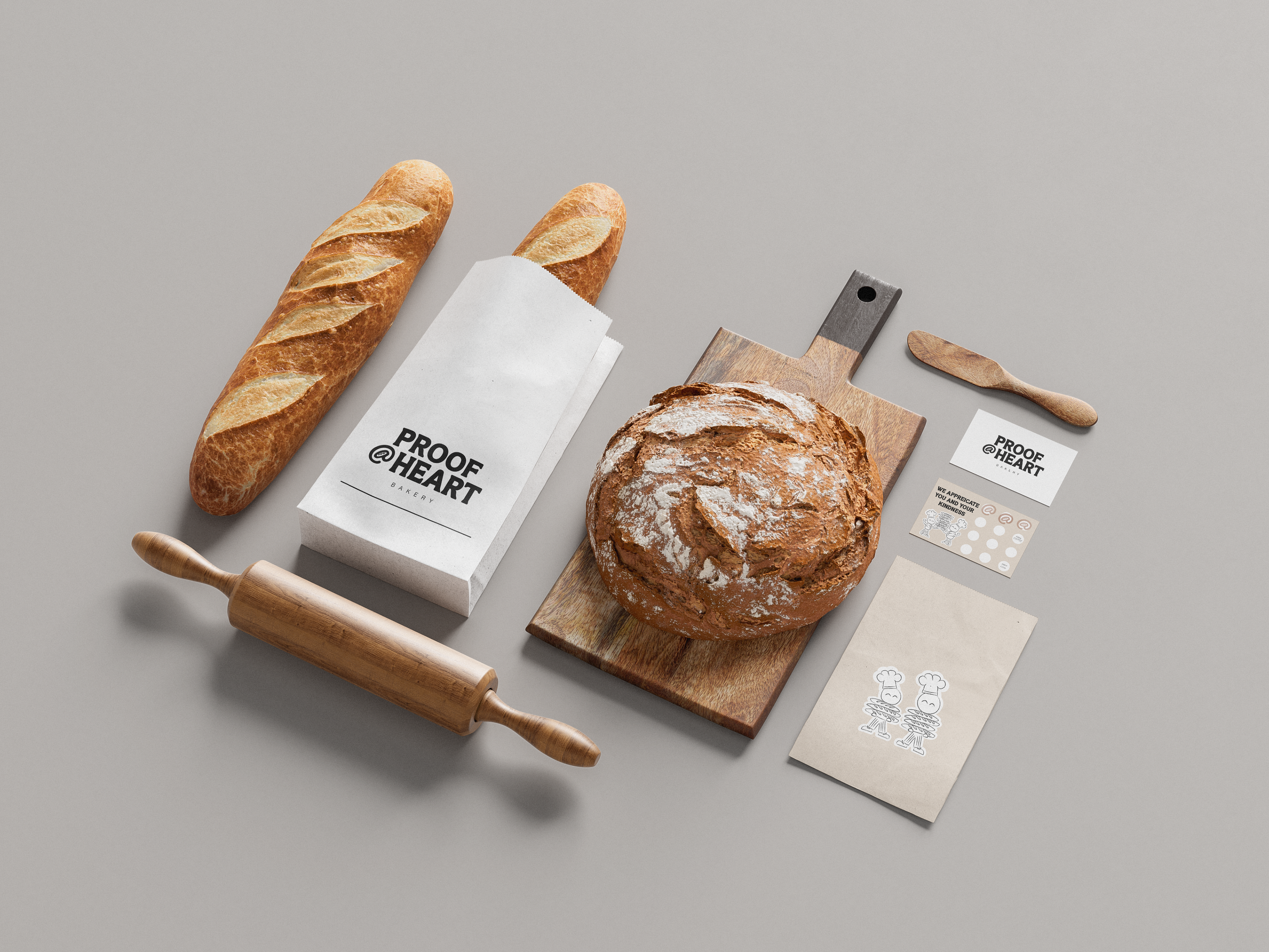
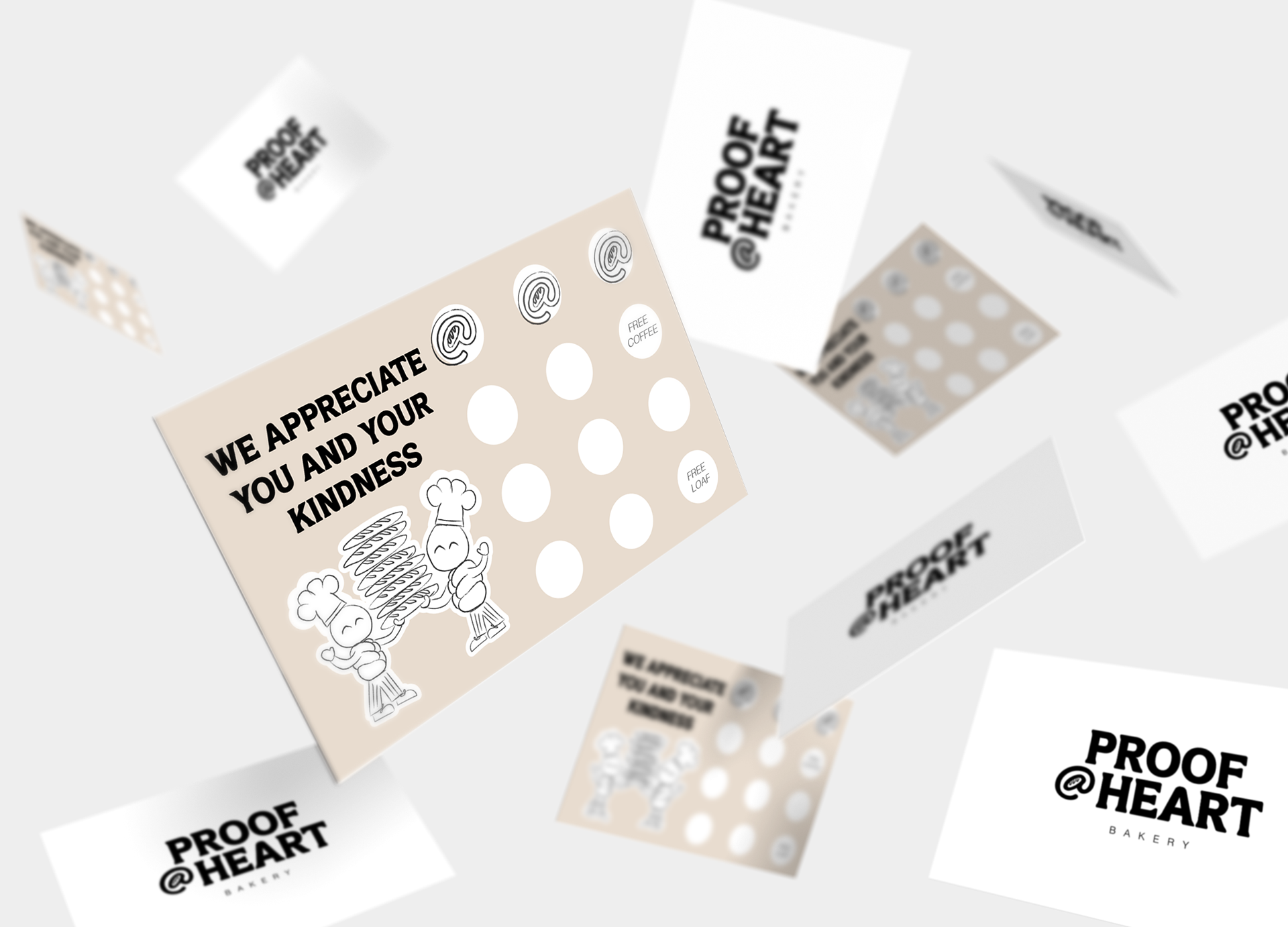
Stationary Assets / Packaging


The Why:
Proof At Heart is more than just a bakery name, but it’s a statement of purpose.
"Proof" is an essential step within the baking process, where the dough rises before it’s baked to perfection, much like this bakery has grown through four generations of skilled bakers. "At Heart" signifies the love and dedication that have been passed down since 1896, as well as the bakery’s commitment to uphold their community.
The baguette inside the @ sign is the ideal visual expression of Proof At Heart's branding: respecting and reinforcing tradition while embracing contemporary design. It’s a simple yet meaningful way to show that while the bakery stays fresh and relevant, its heart will always be in the craft and the people it serves.
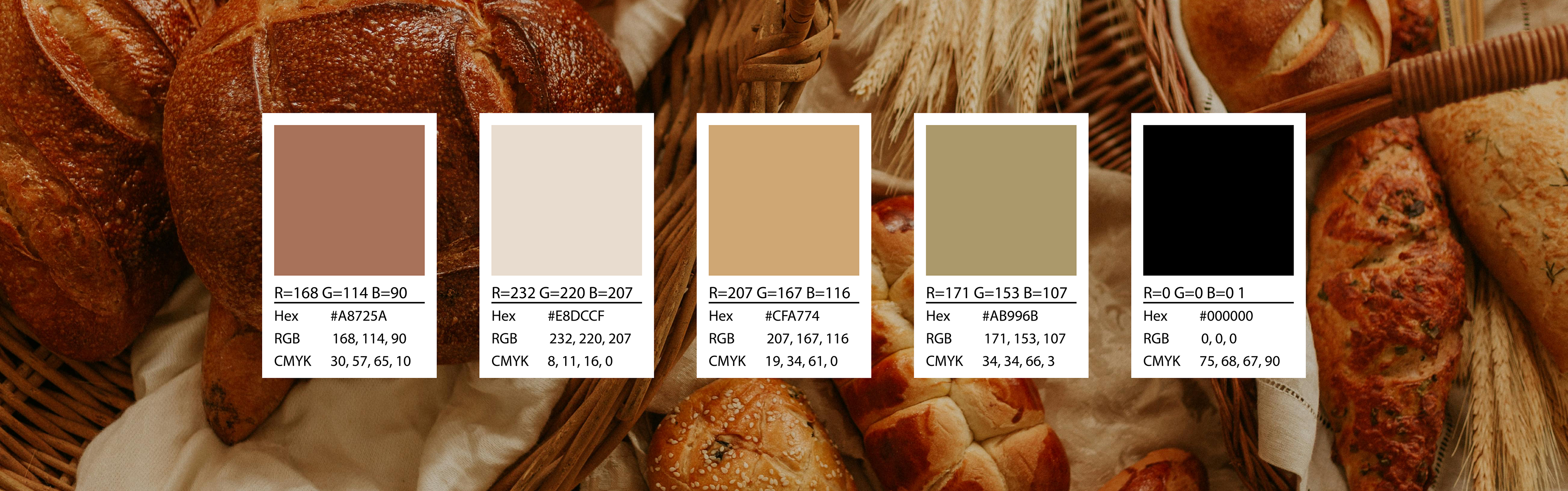
Colour Palette:
By drawing inspiration directly from the natural tones of bread, the Proof At Heart colour palette creates an immediate emotional connection to the bakery’s core product. The golden-brown hues bring to mind the satisfying crispness of a freshly baked crust, while the creamy beige reflects the soft, airy inside. The muted grey introduces a sense of balance, grounding the palette in a way that feels elegant and timeless. Finally, the deep black ensures legibility and contrast, keeping the branding fresh and modern. This combination works beautifully to evoke both nostalgia and contemporary craftsmanship.
Recommended Use Of Palette:
Background: #E8DCCF
Body Text: #000000
Accent (buttons, borders, icons, highlights): #A8725A, #CFA774, #AB996B


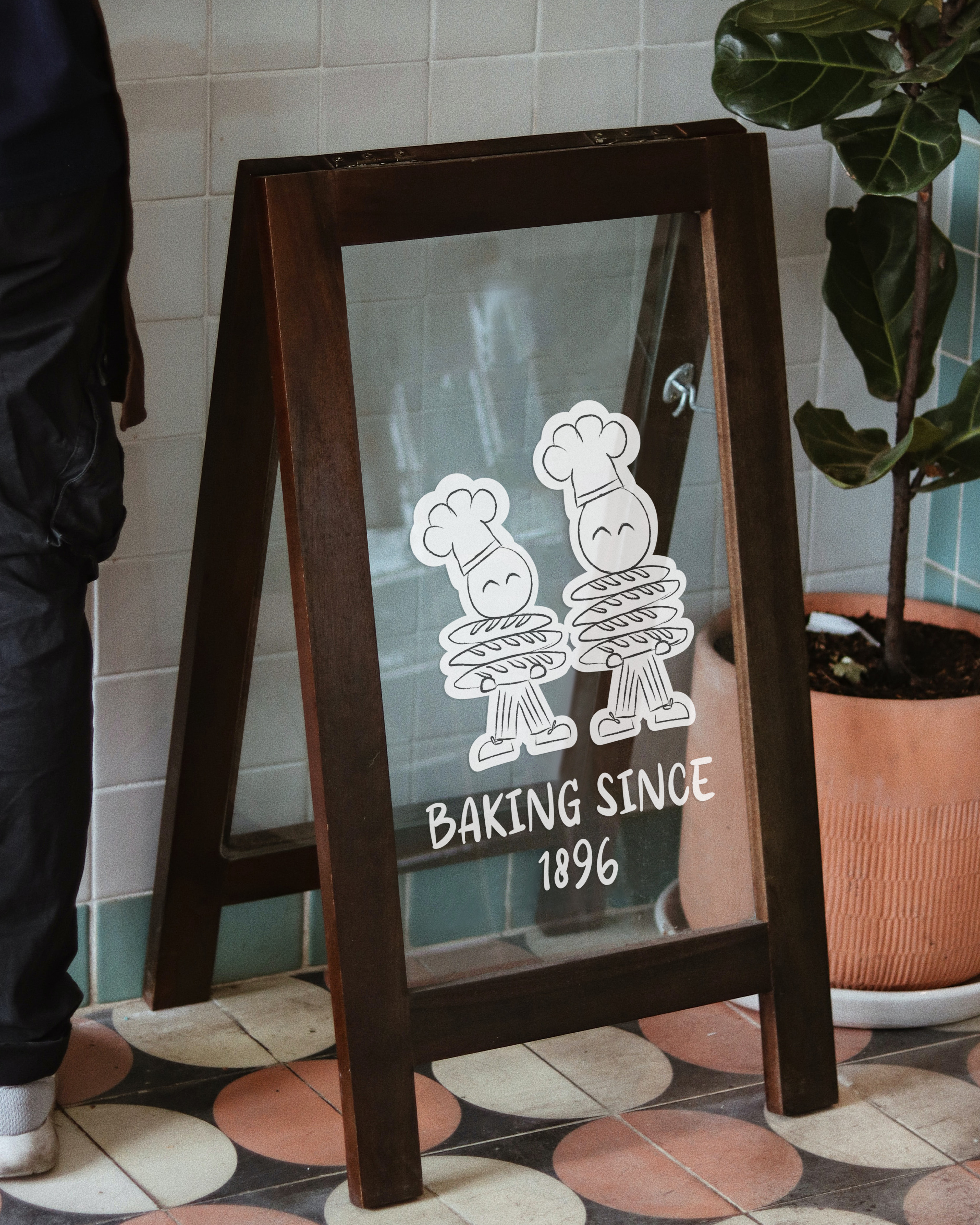
Brand Characters