Client’s Vision for Rebranding
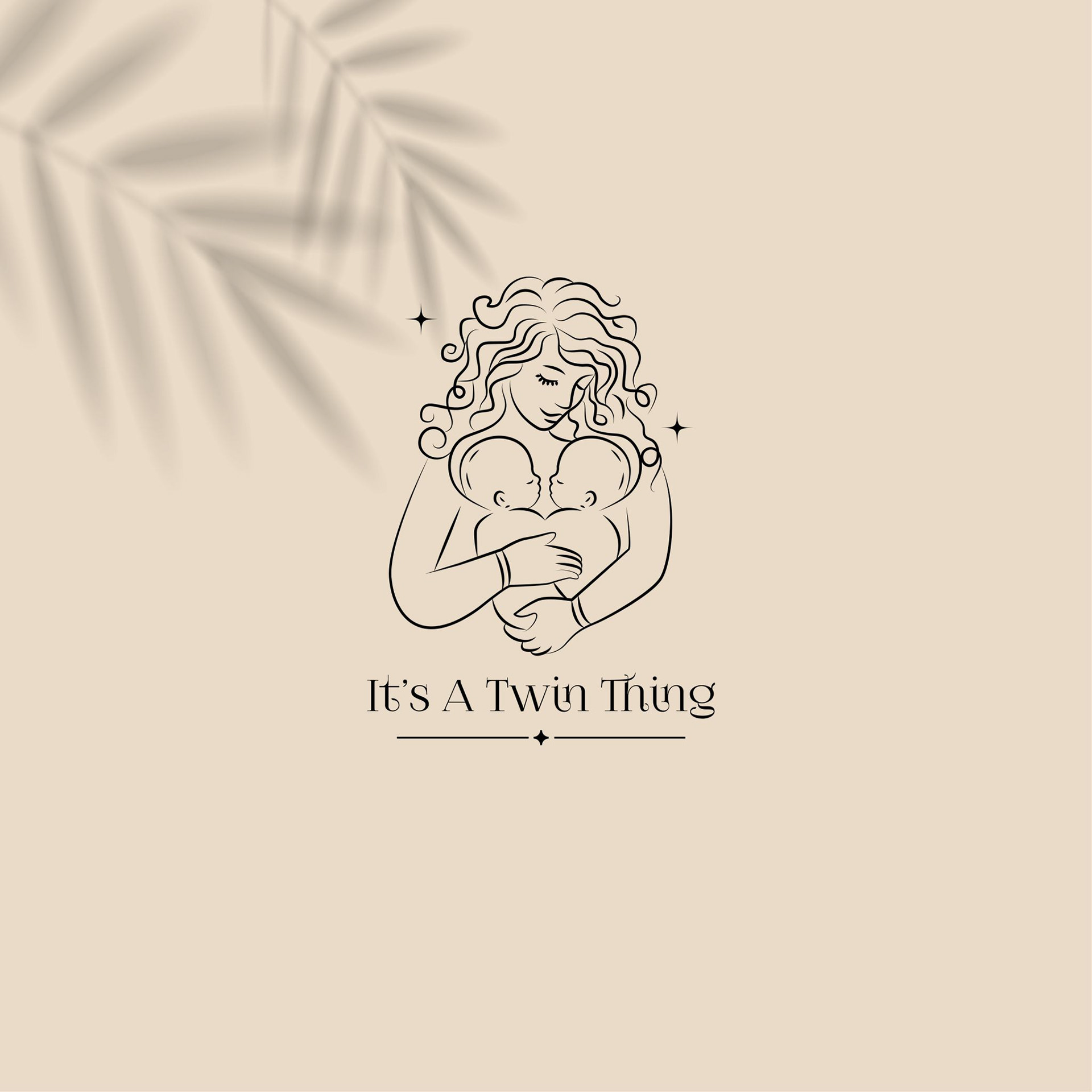
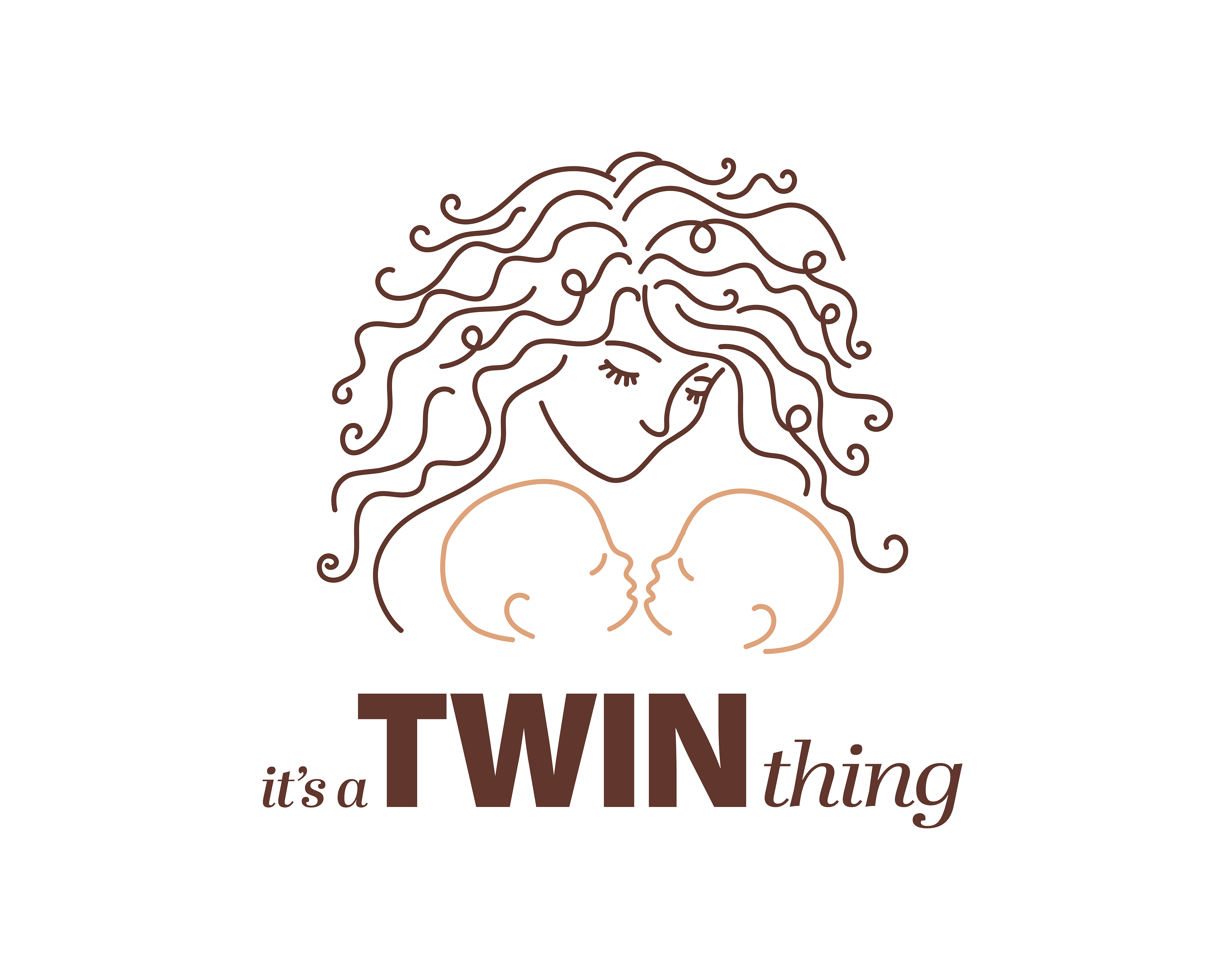
While the client valued the symbolism and emotional impact of the original logo, she recognised the need for a cleaner, more scalable design. The goal was to preserve the mother-and-twins imagery while simplifying the composition, ensuring it remains impactful at any size, whether on a business card or a large promotional banner.
THE BRIEF:
ReTouch Current Logo
Responsive Logos
Colour Palette
Typography
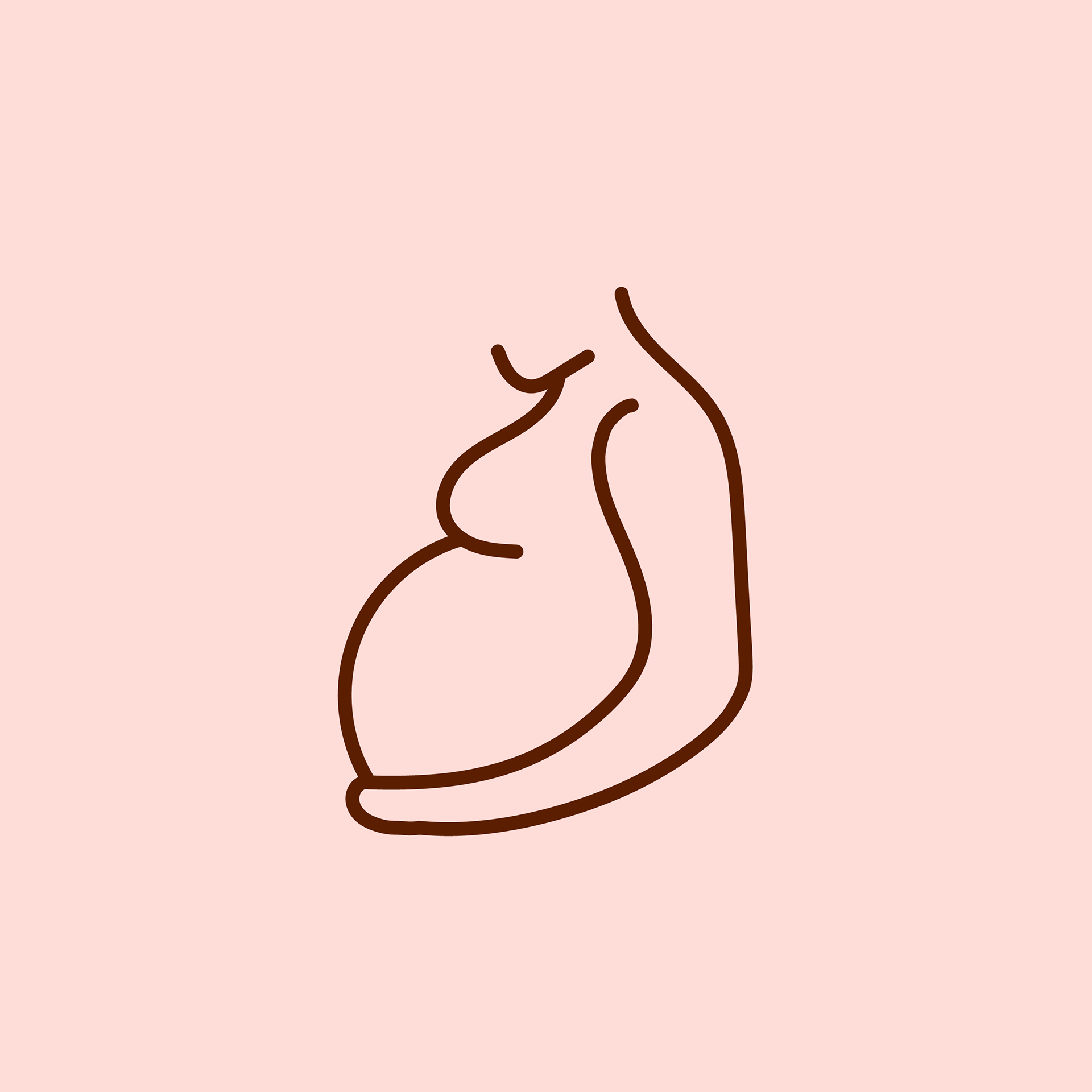
Social Media Icon
Illustrations
Must be feminine and represent fertility


Alternate Logos

Instagram Highlight Icons

Activities

Blog
Out N About

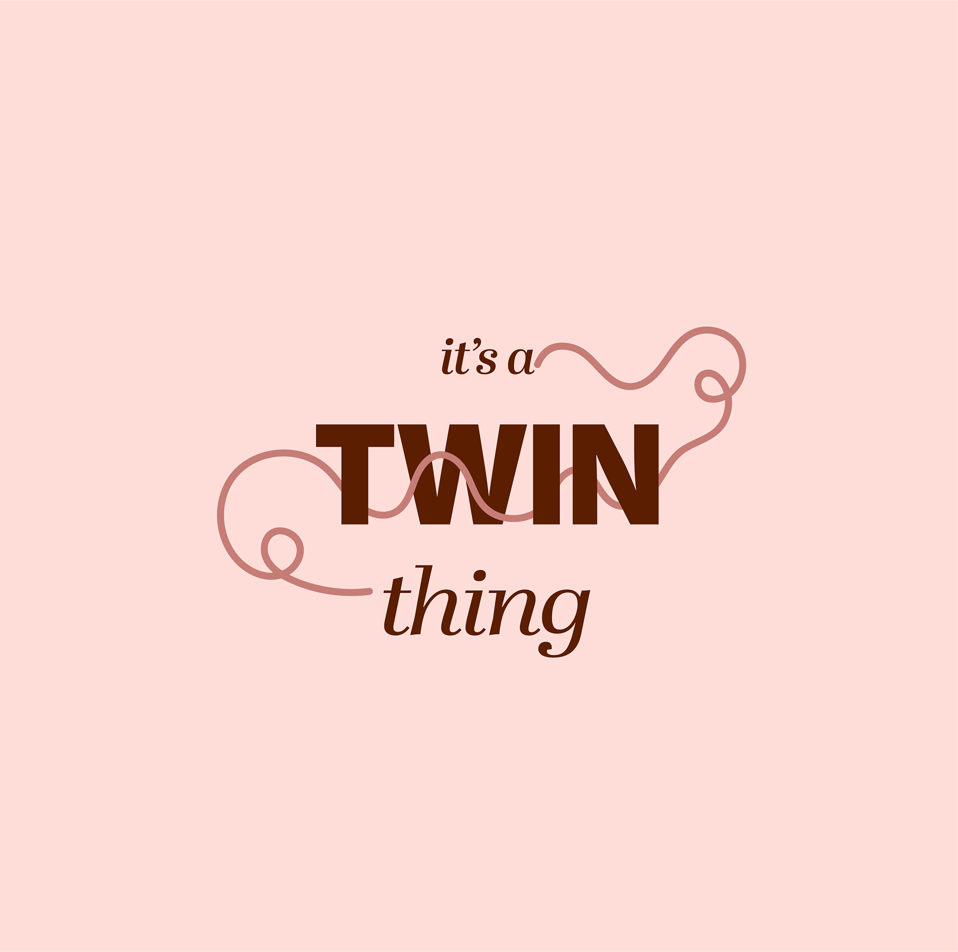
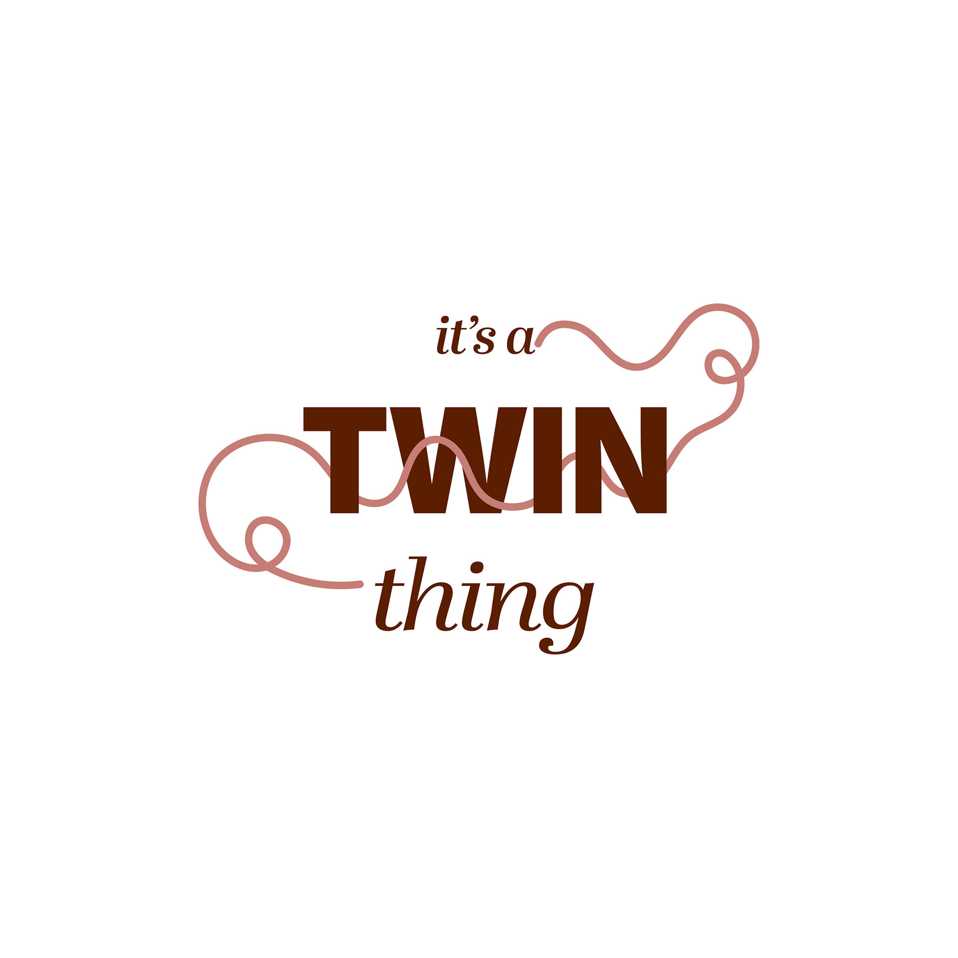
Twin Things

Postpartum
Pregnancy
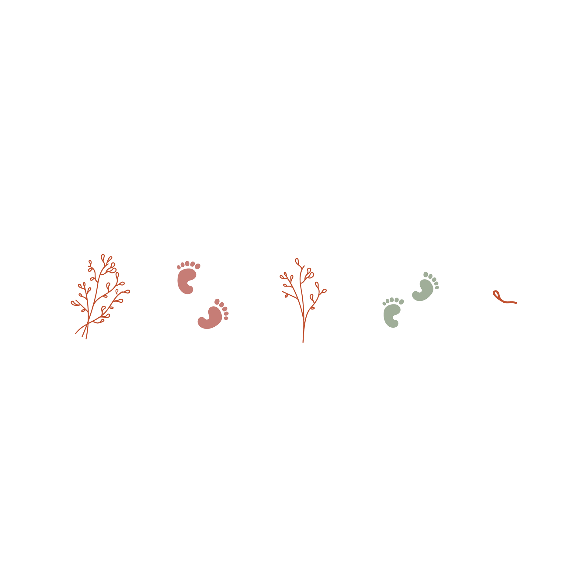
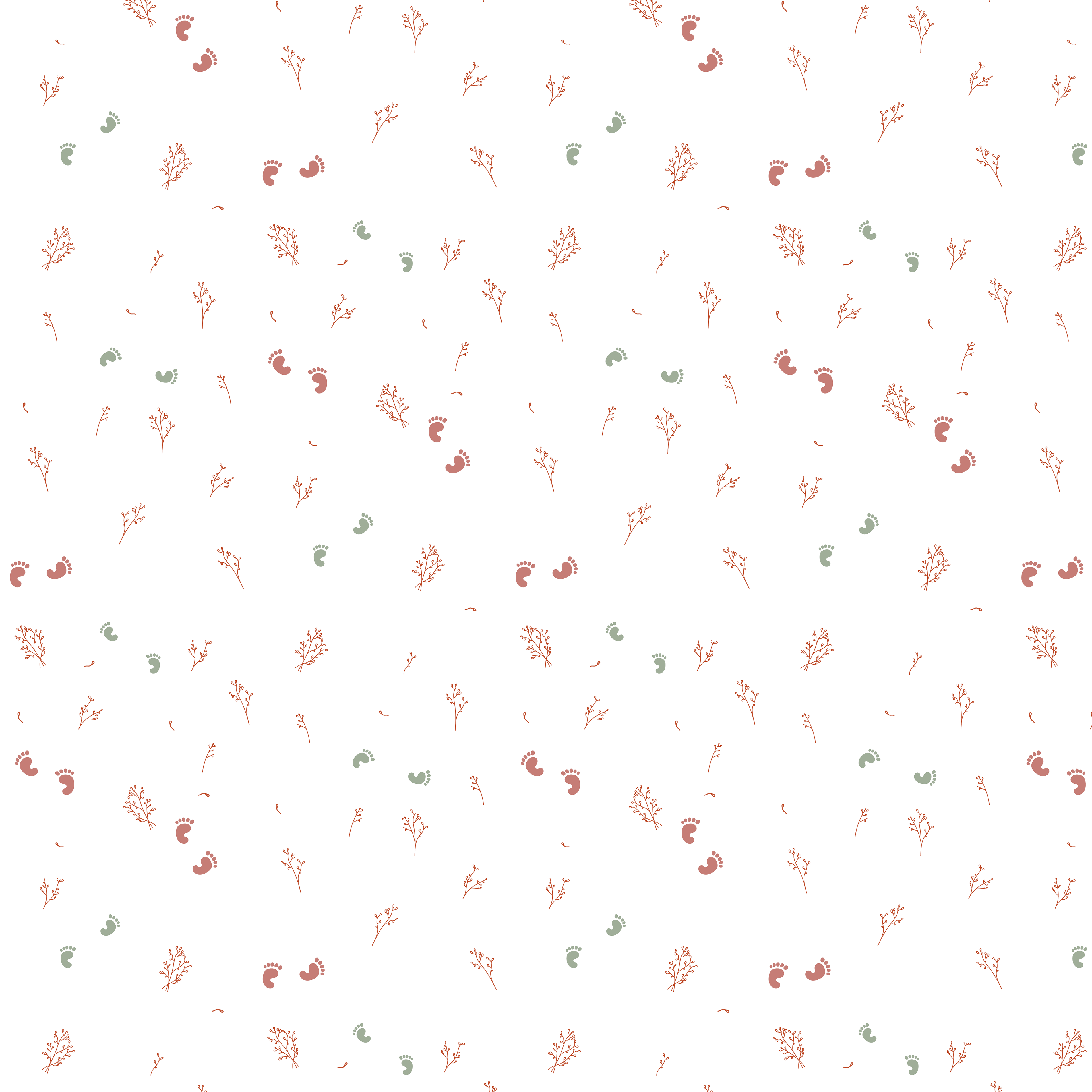
Brand Illustrations / Pattern
These icons present the core values of the brand: fertility and femininity.