THE BRIEF
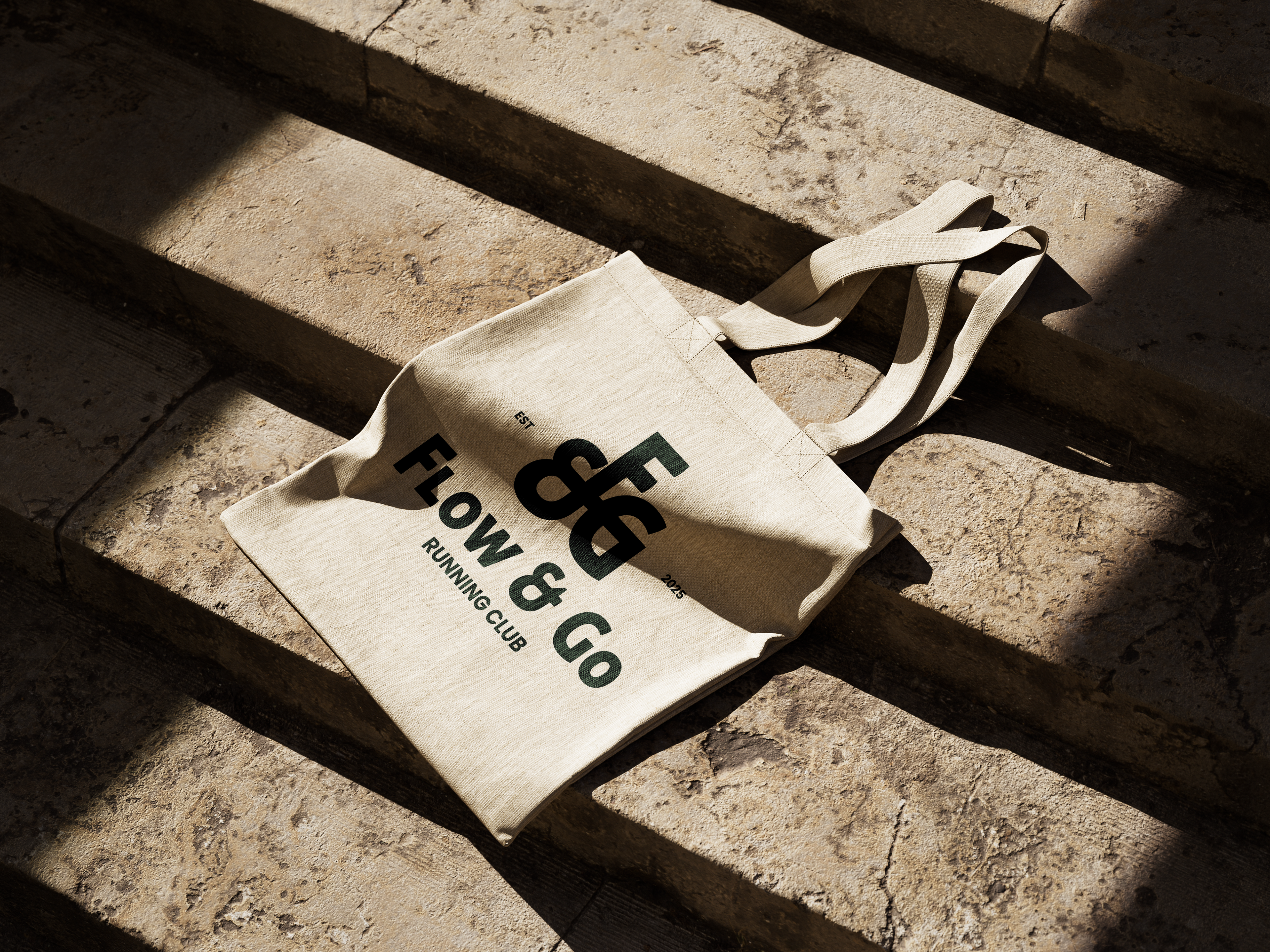
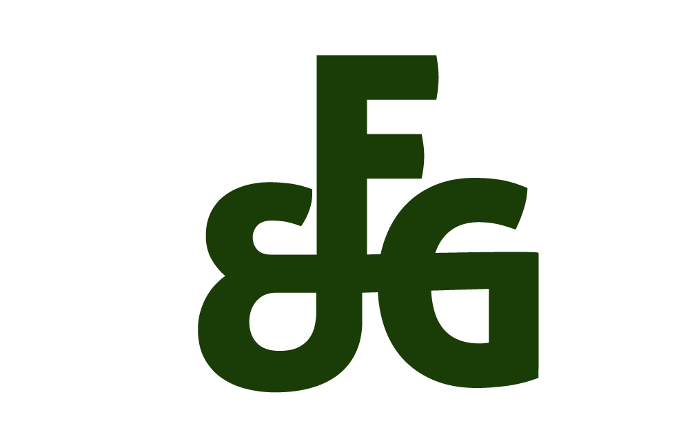
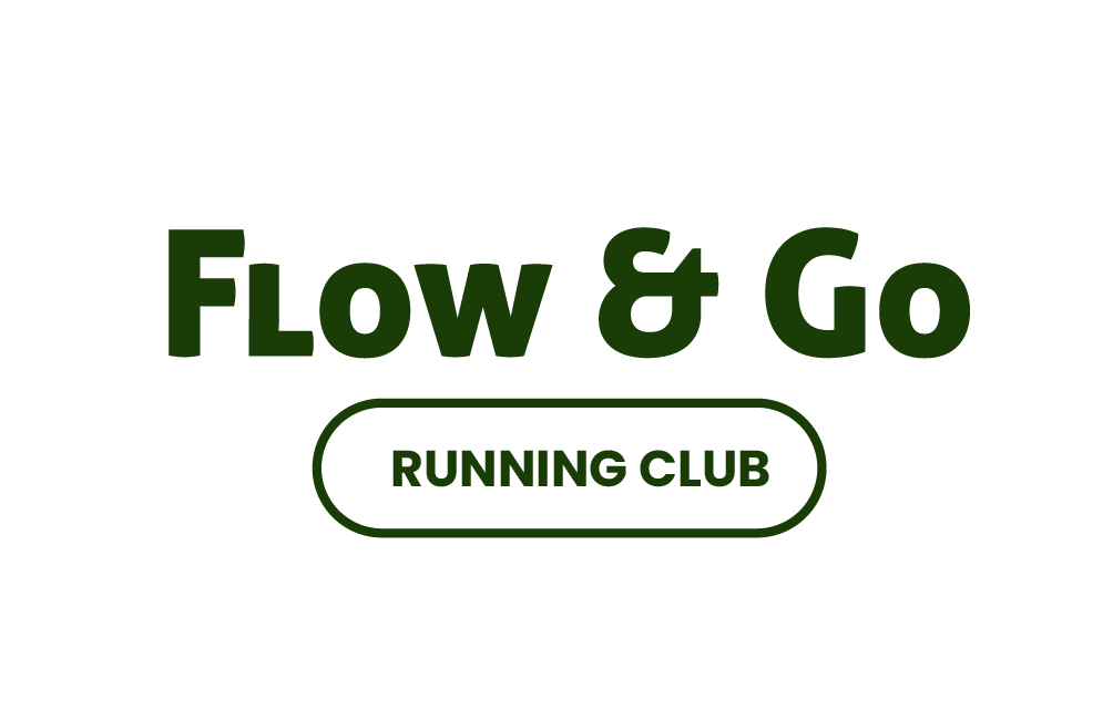
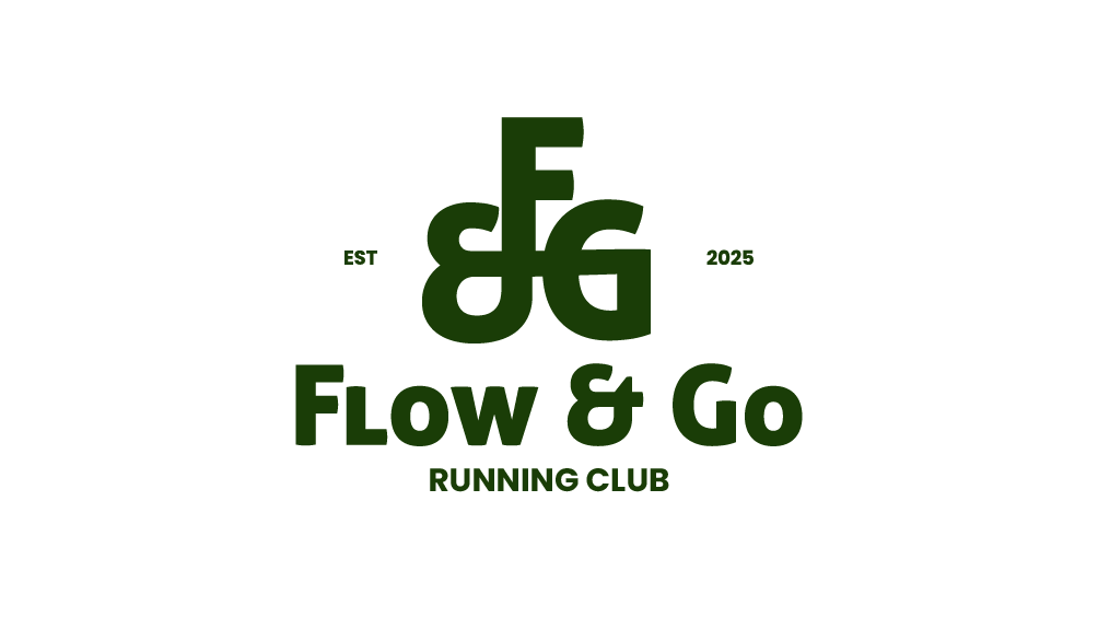
Responsive Logo: Primary, Wordmark & Lettermark
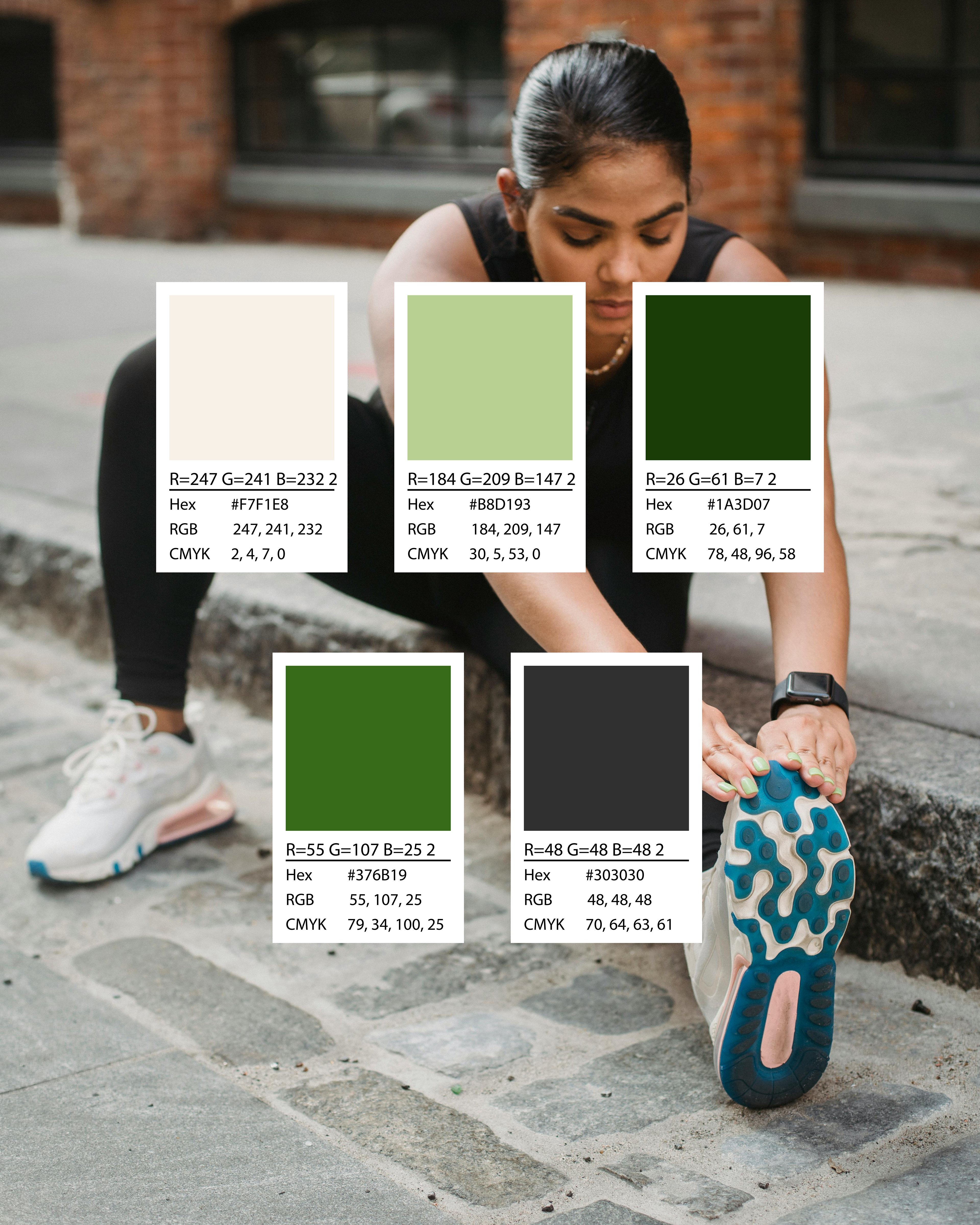
Colour Palette
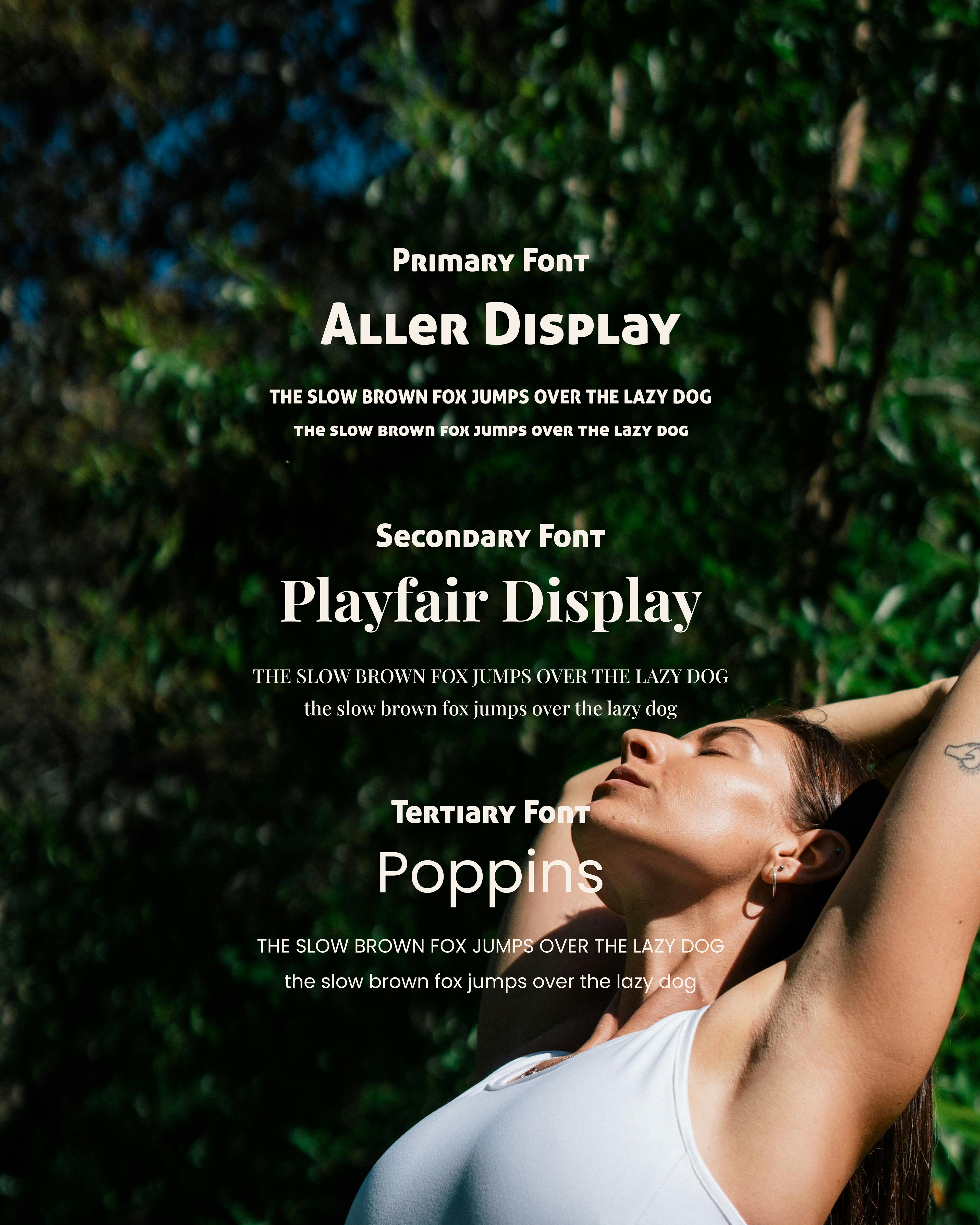
Typography Suite
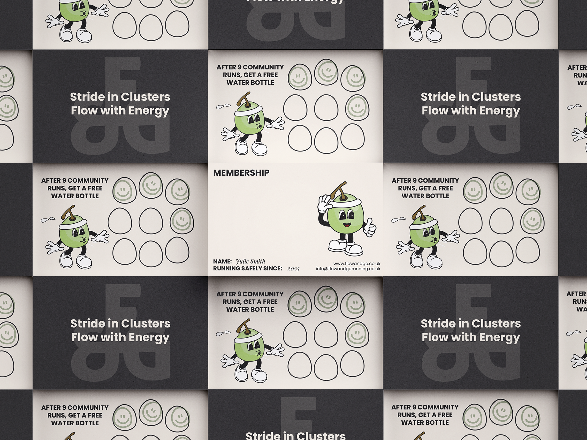
Members Card & Loyalty Card
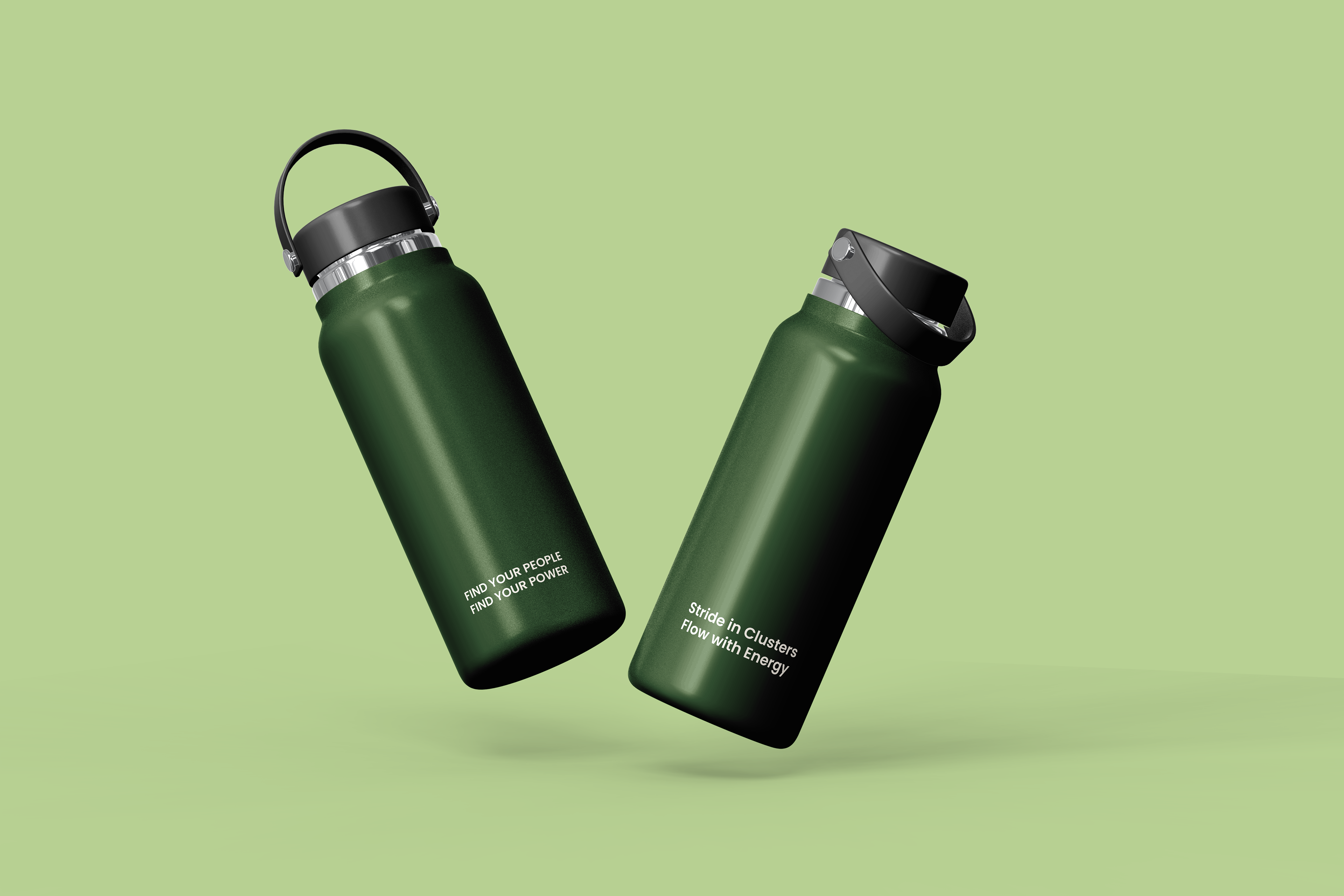
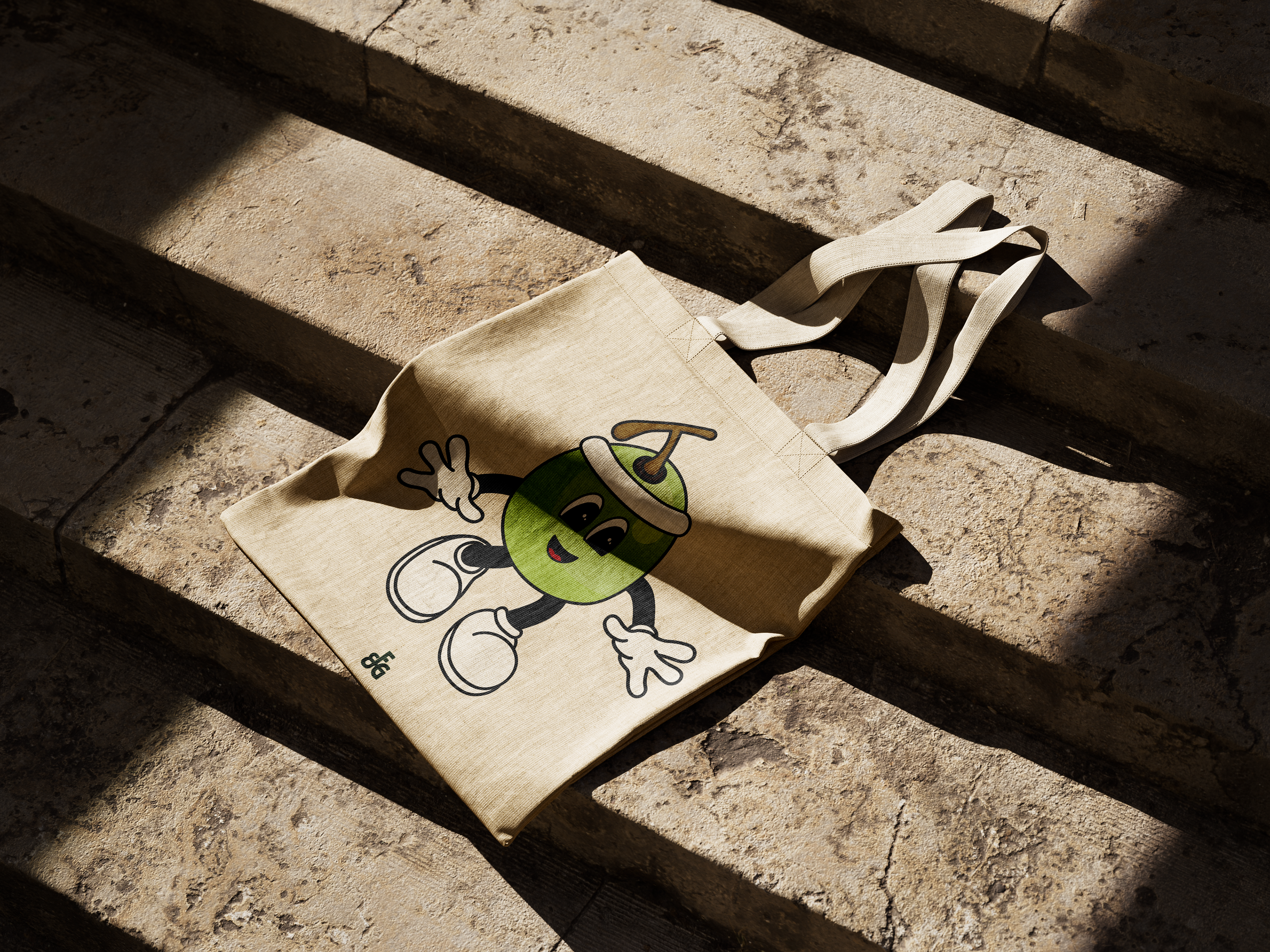
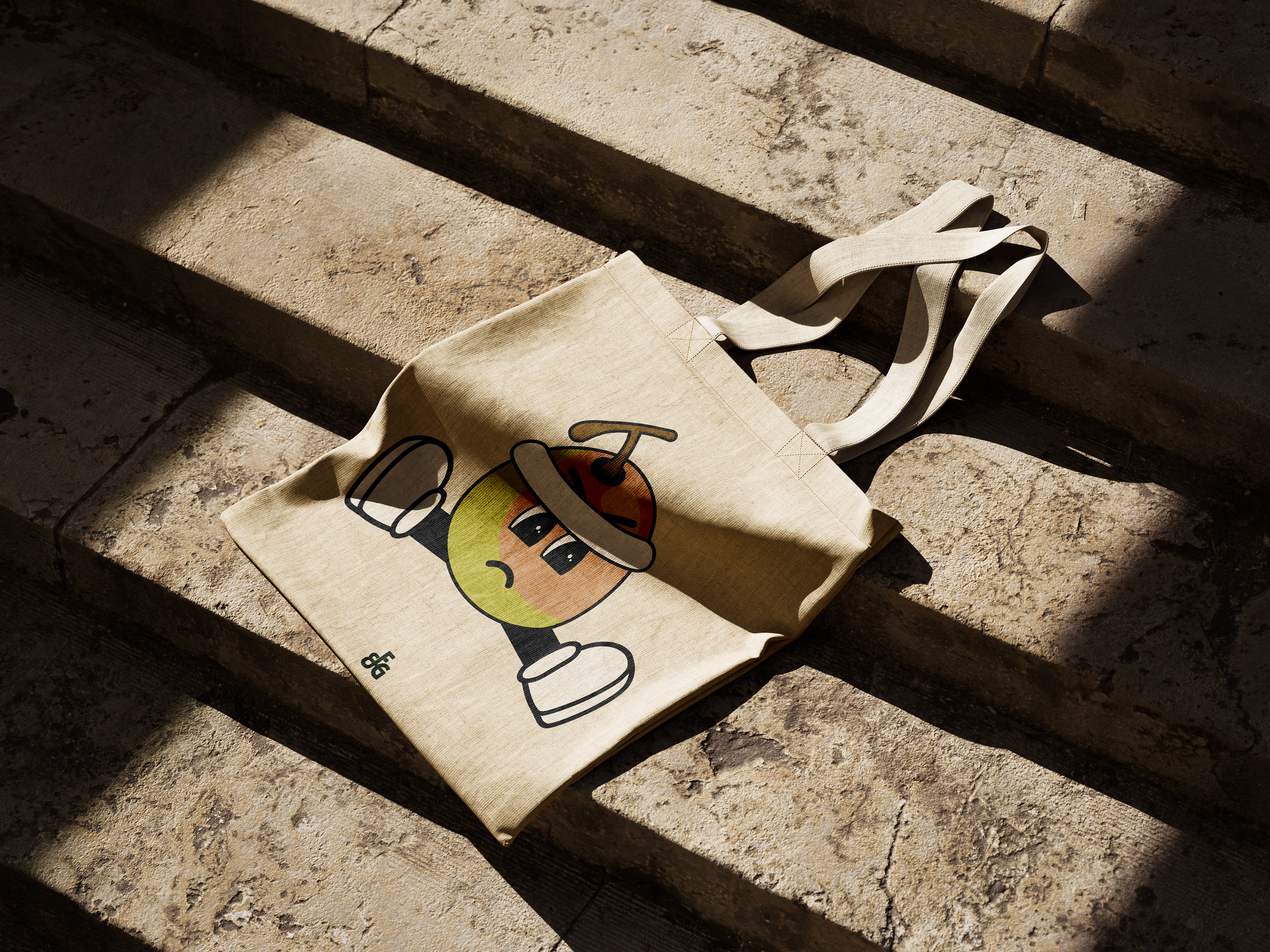
Merch

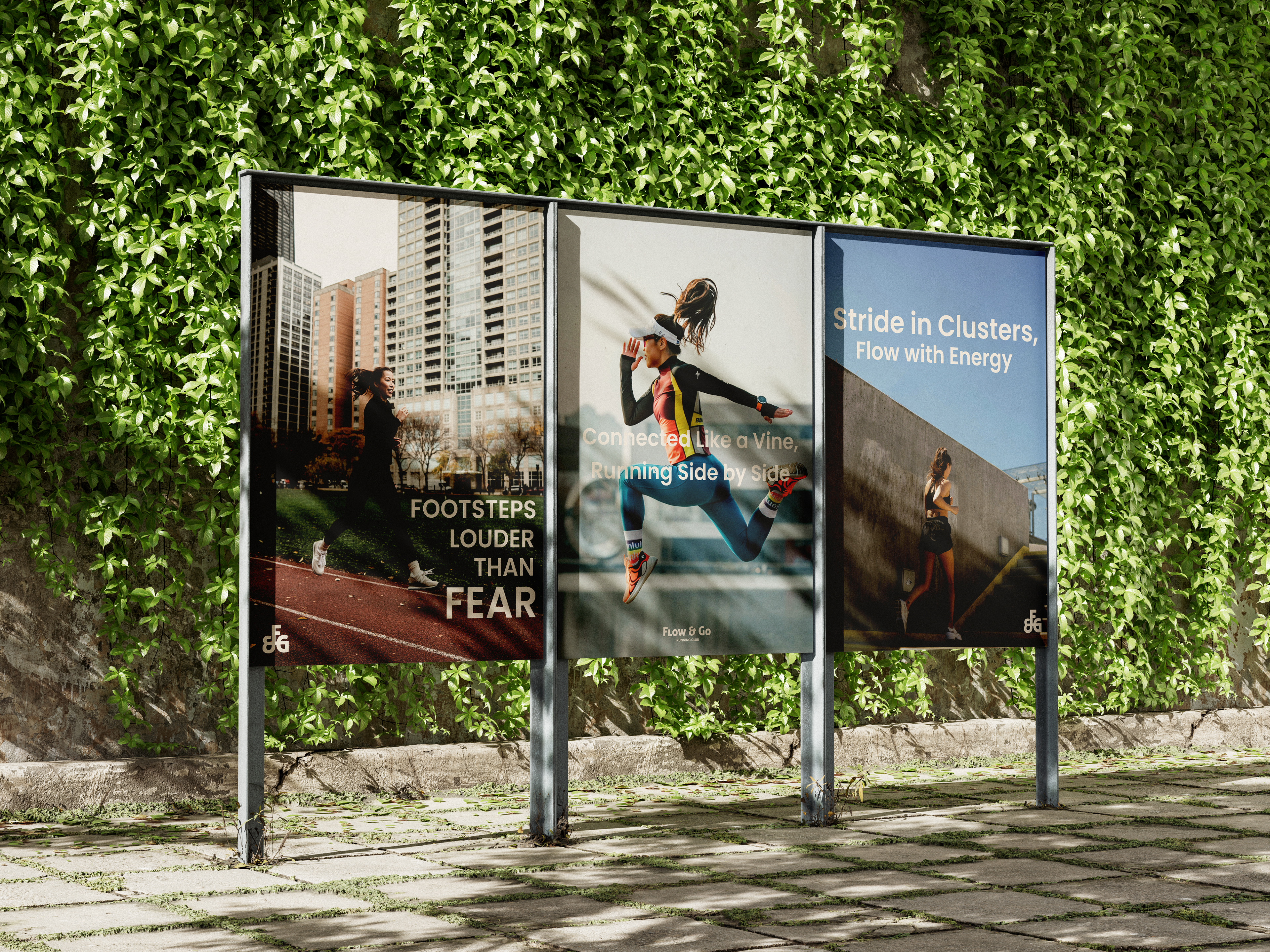


The Why:
The inspiration behind Flow and Go’s branding comes from the vibrancy of green grapes symbolising growth, vitality, and community. They grow in clusters, which just like this community encourages movement, wellness, and connection for women and gender-expansive folks.
The soft, earthy greens reflect the freshness and resilience of the community, while the warm neutral tones add a sense of inclusivity and comfort. The mascot ties it all together with playful, energetic, and a perfect embodiment of the club’s mission to keep moving forward together.