THE BRIEF
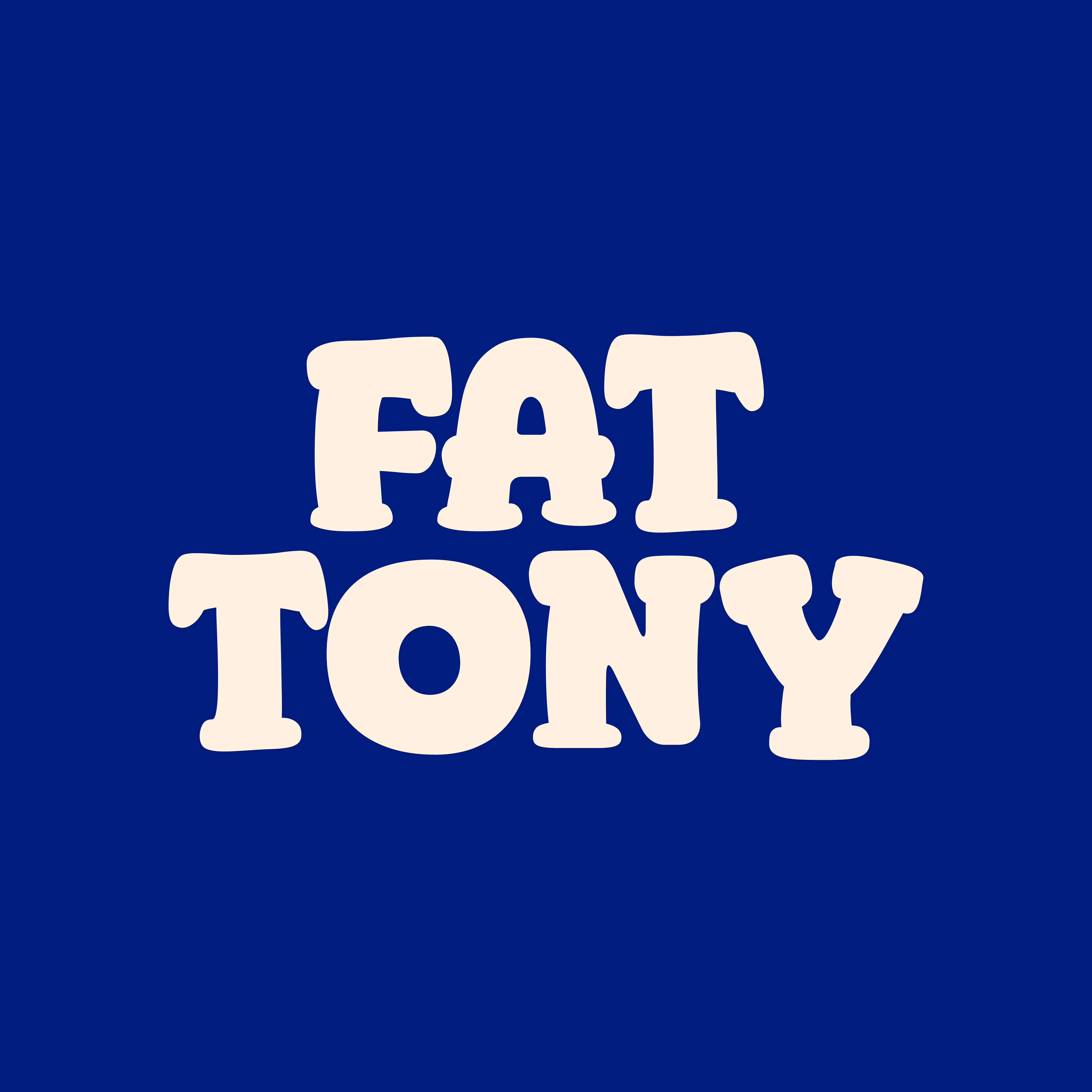
Responsive Logo: Primary, Wordmark & Lettermark
Colour Palette
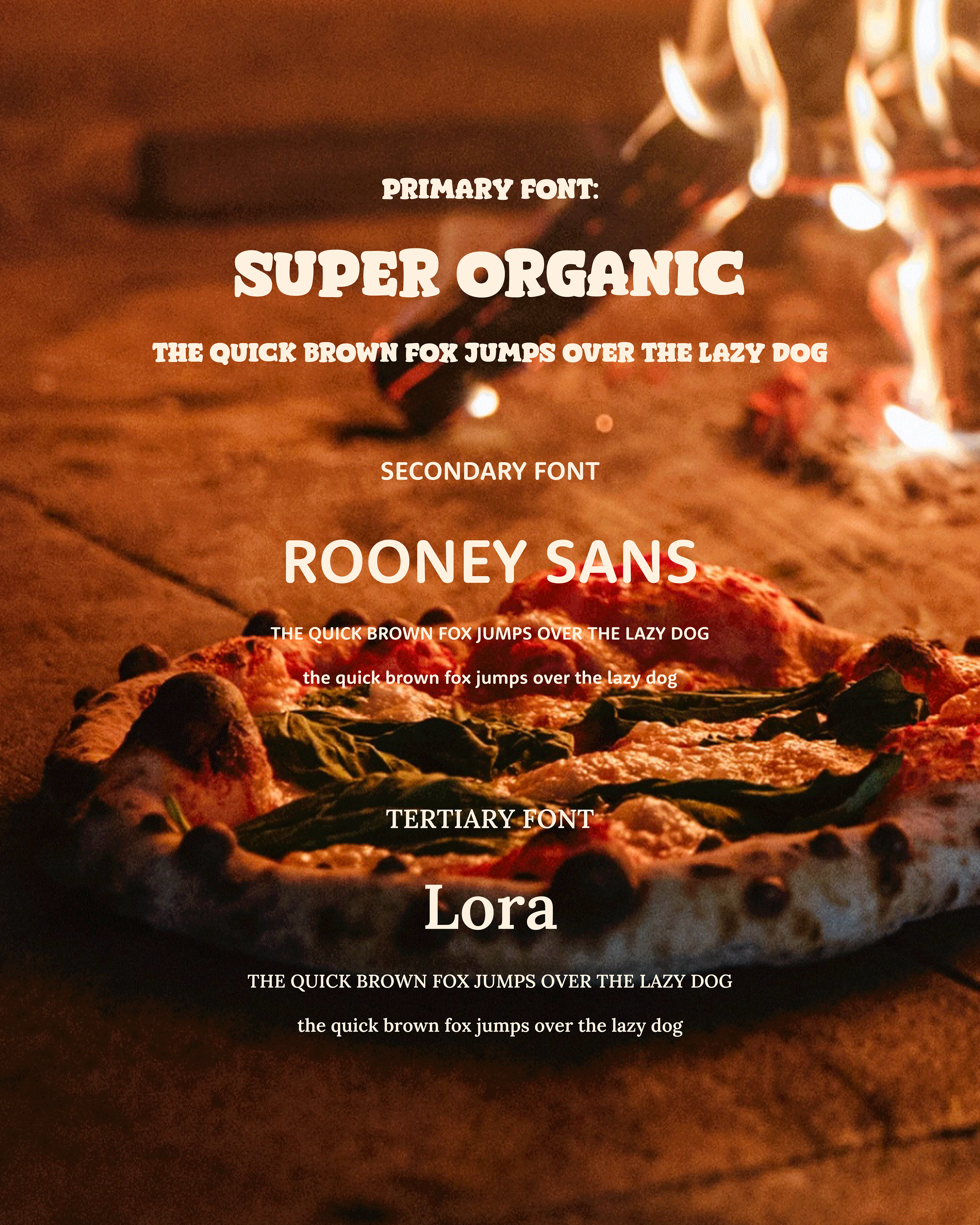
Typography Suite
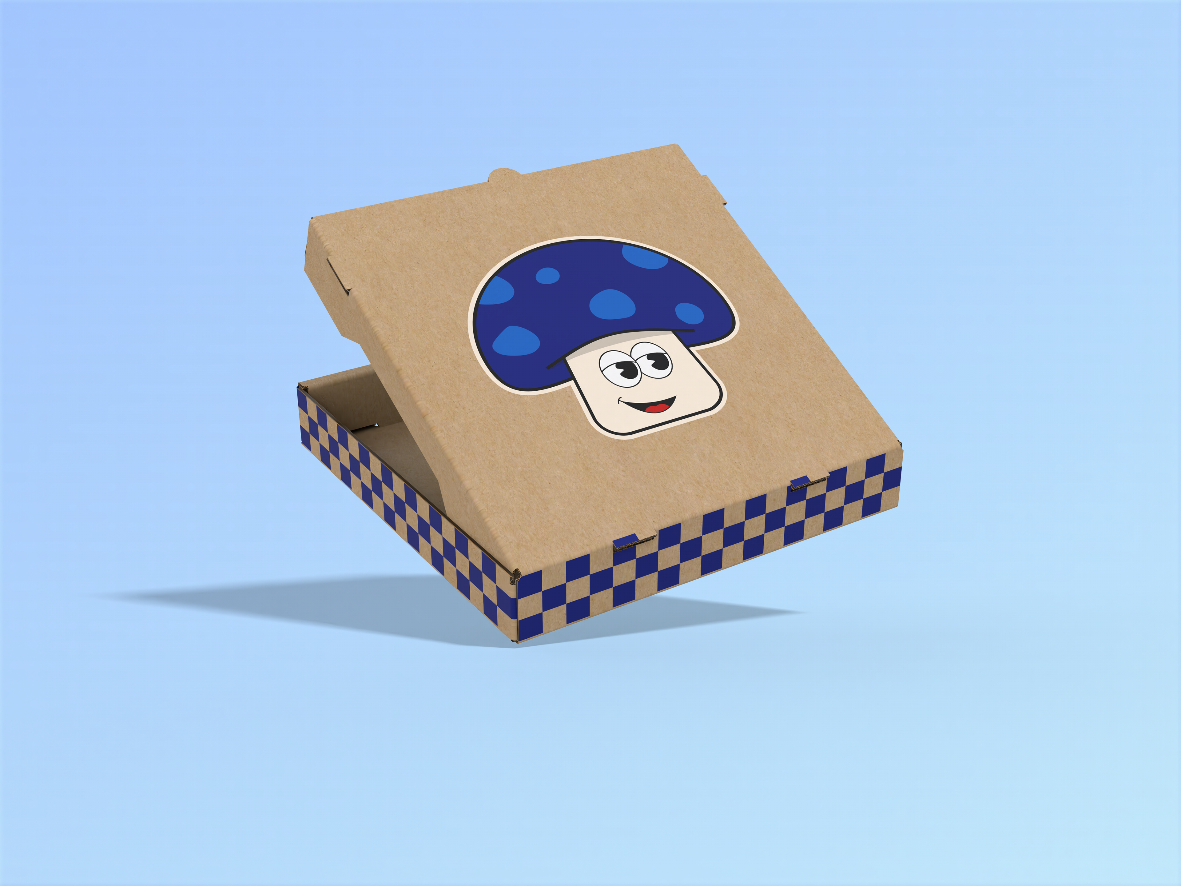
Packaging
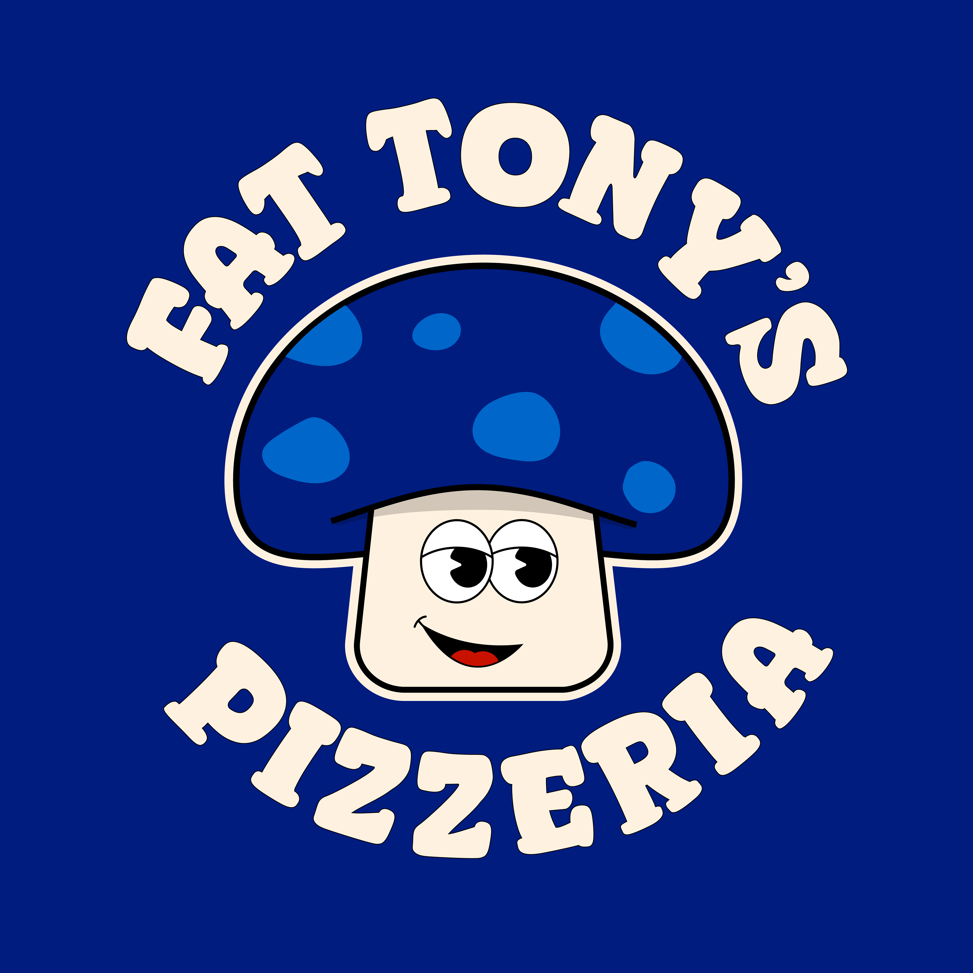
Must avoid traditional colours of a pizzeria and must have a fun mascot
Colour Palette
This palette strikes a strong balance between warmth and boldness, perfectly complementing the brand’s art direction. It enhances the rich, inviting tones of food photography often used by pizzerias, while adding a modern, energetic edge. This combination helps create a cohesive, eye-catching feed that feels both cosy and contemporary which is ideal for drawing attention and sparking appetite on social media. The soft white is used to break up the darker and brighter tones between the images and text.