The Brief
Company Name
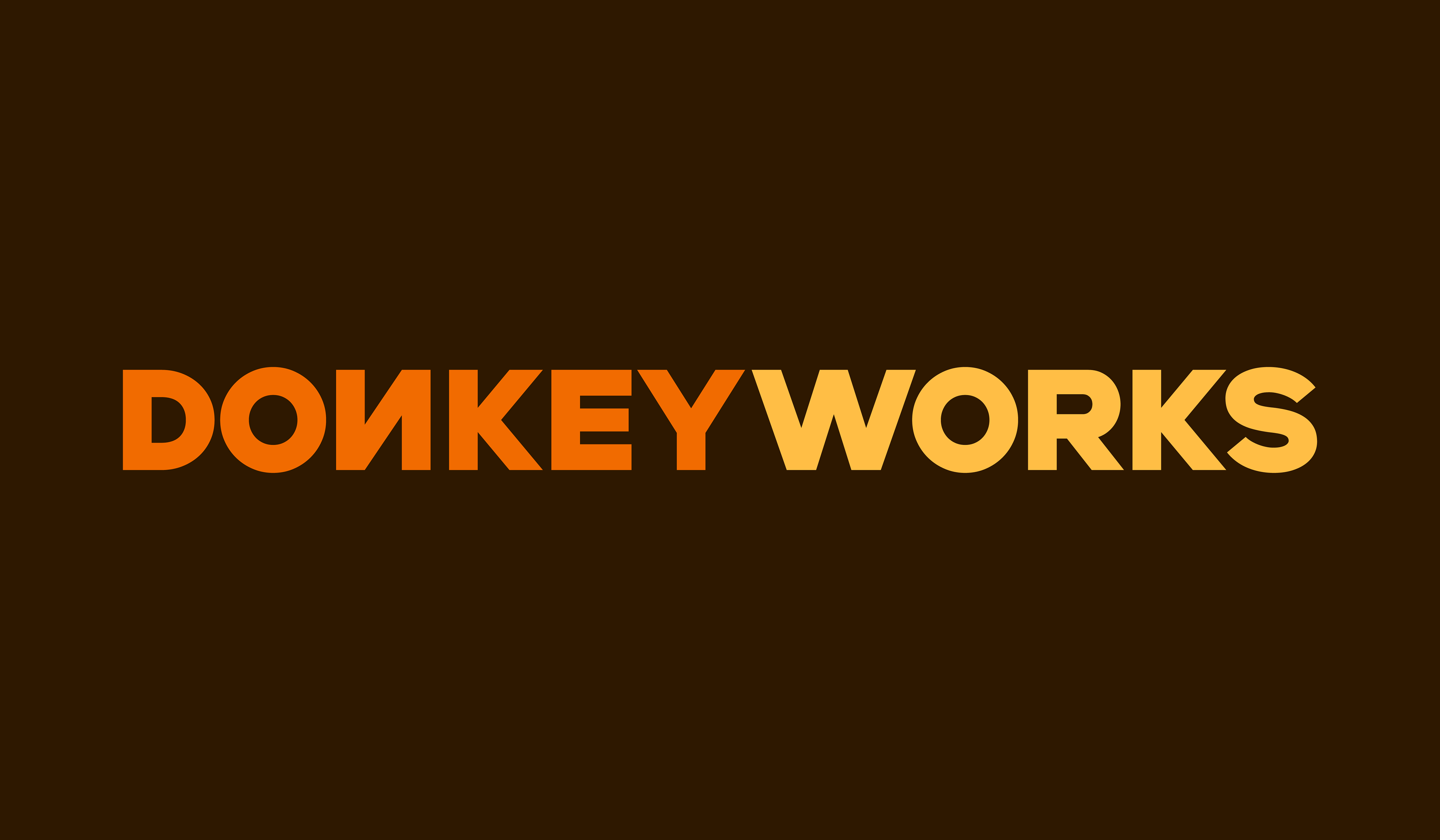
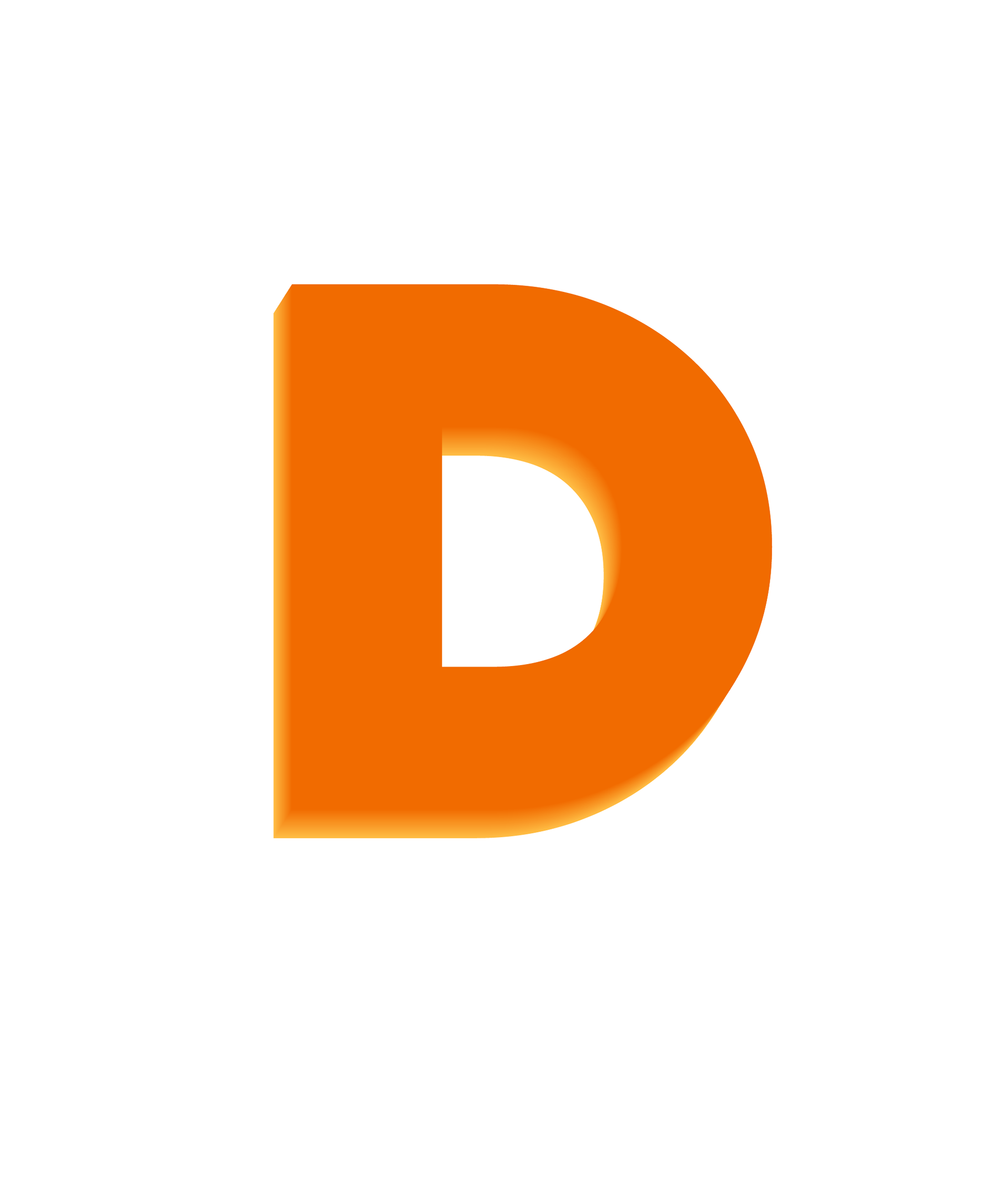
Responsive Logo: Primary, Wordmark & Lettermark
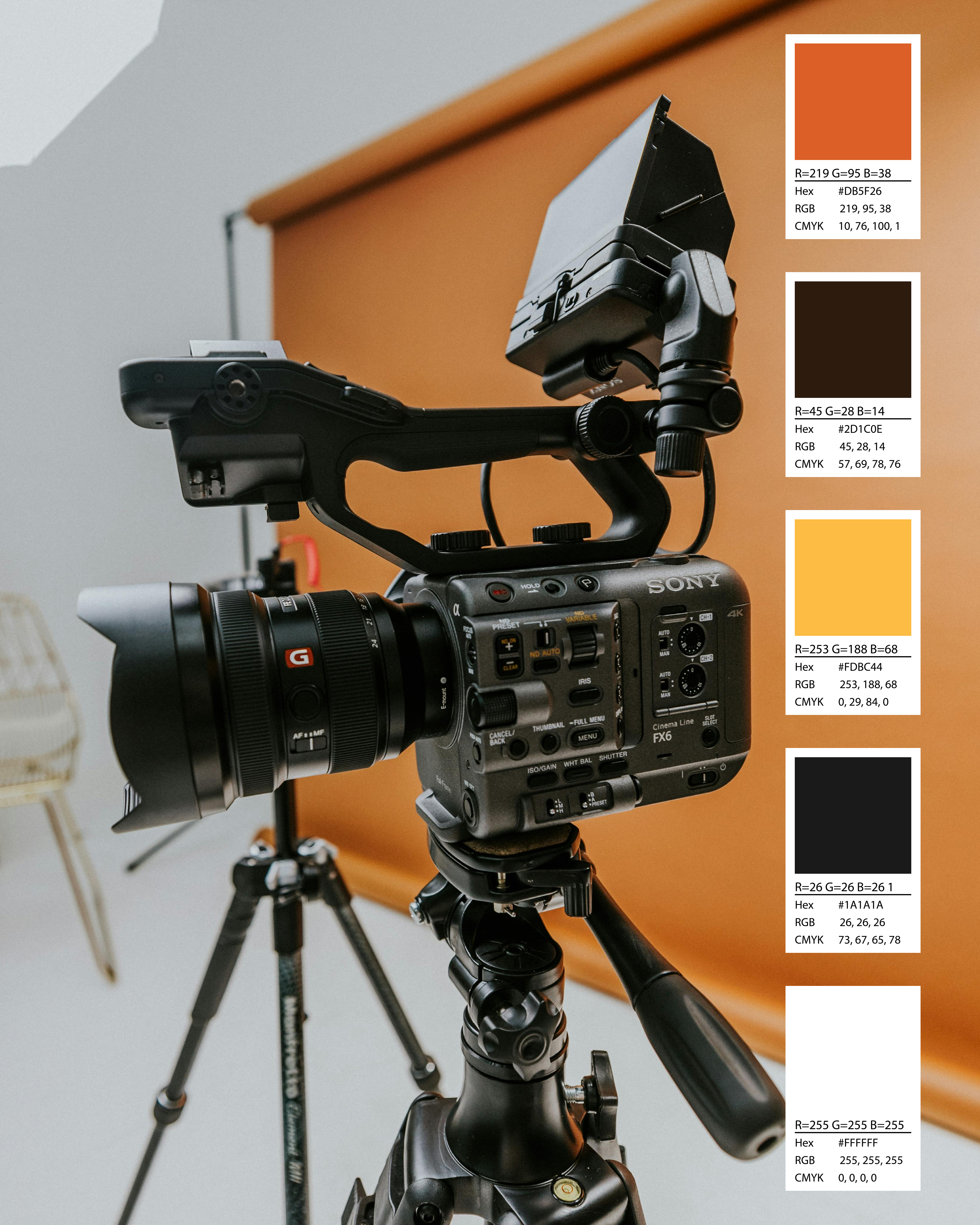
Colour Palette
Typography Suite
Stationary Assets
Must contain the colour orange, emulates the studio's core values of showing resilience by being bold and approachable


Why Donkey?
Donkeys are recognised for their strong work ethics and great adaptability which is what we strive to represent within the industry. Despite being misunderstood animals who typically get referred to as unruly and uncooperative, their ability to think critically and assess a situation makes them an asset to any team. These are some of the key traits we will be watching out for when building our team.
Our mission is to break down deep-rooted unconscious classism and nepotism within the industry. Due to cultural stereotypes and historical bias, donkeys tend to be viewed as lower/working-class animals, which is who we are representing. By giving extremely talented people the opportunity to break through the system, we will be changing generations of repression.
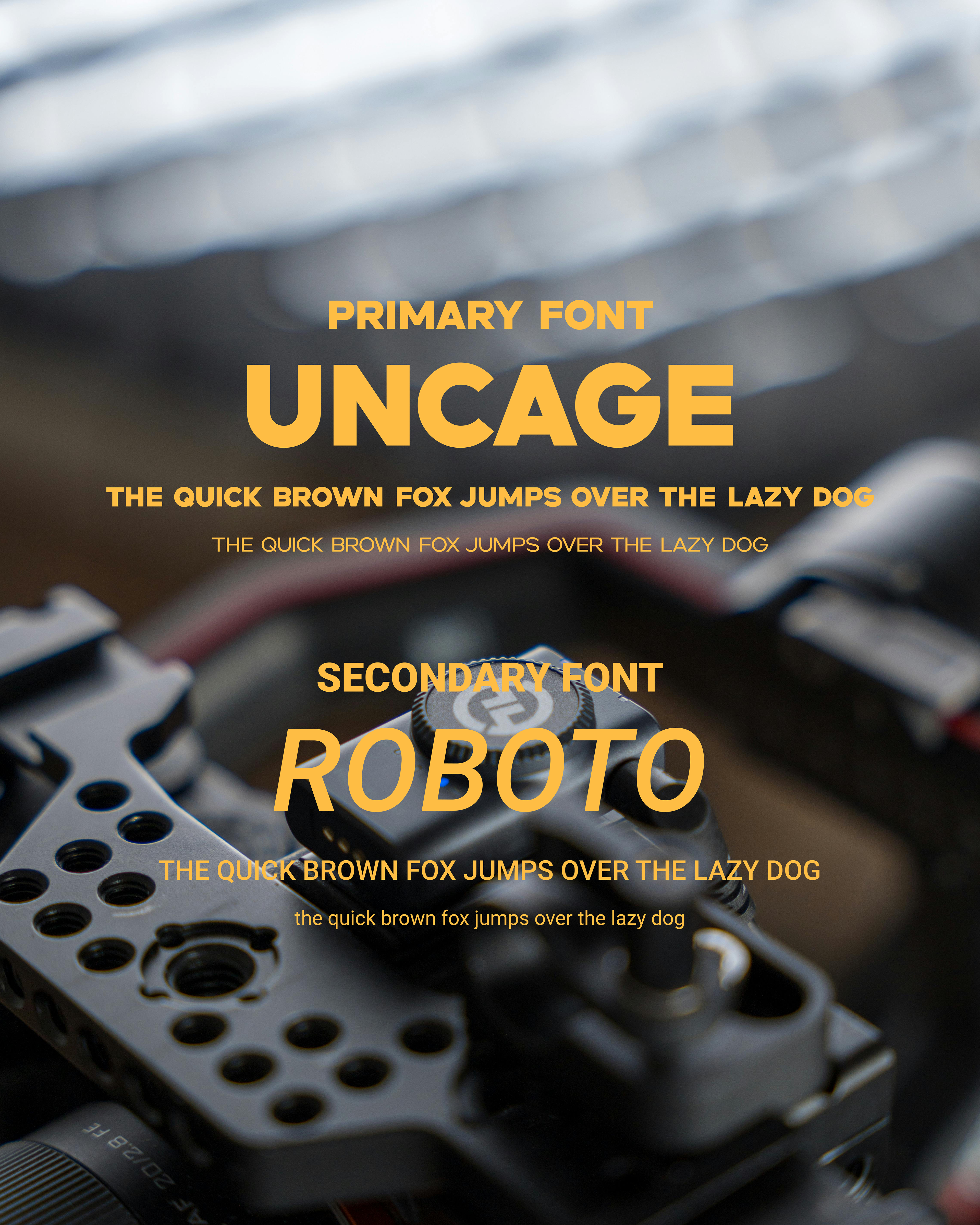
Typography Suite
We used a Serif font across all the branding. Serif fonts can look more authoritative in comparison to Sans Serif or display fonts to suggest the weight of experience within the team at Donkeyworks. We kept the font bold and simple, making it extremely scalable for the business since that was extremely important for the client. The 'N' in Donkeyworks is backwards to represent the studio going against the grain of the industry, as it's part of the company's mission to create space for all.