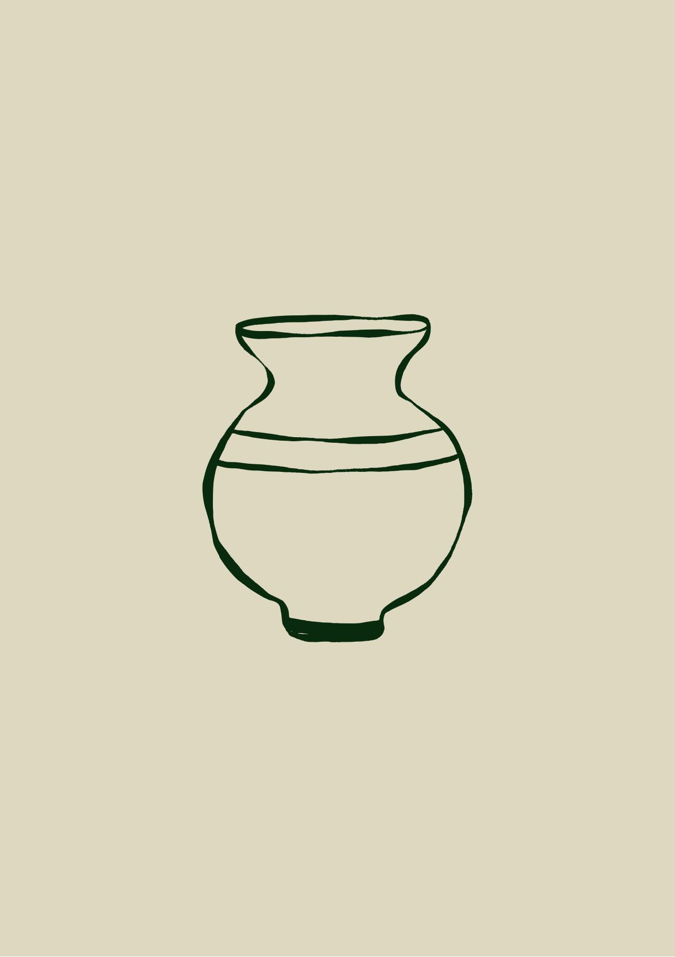
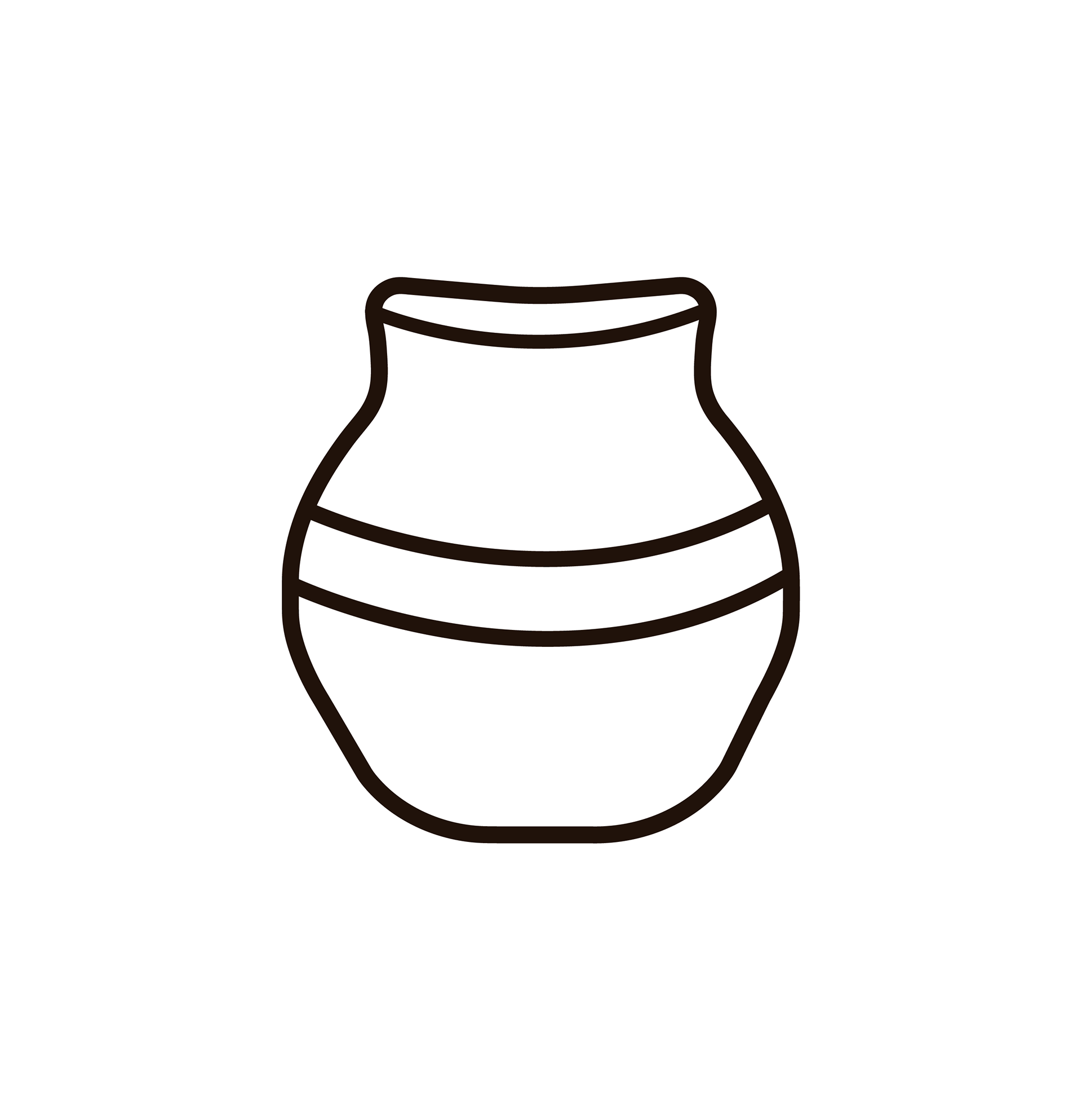
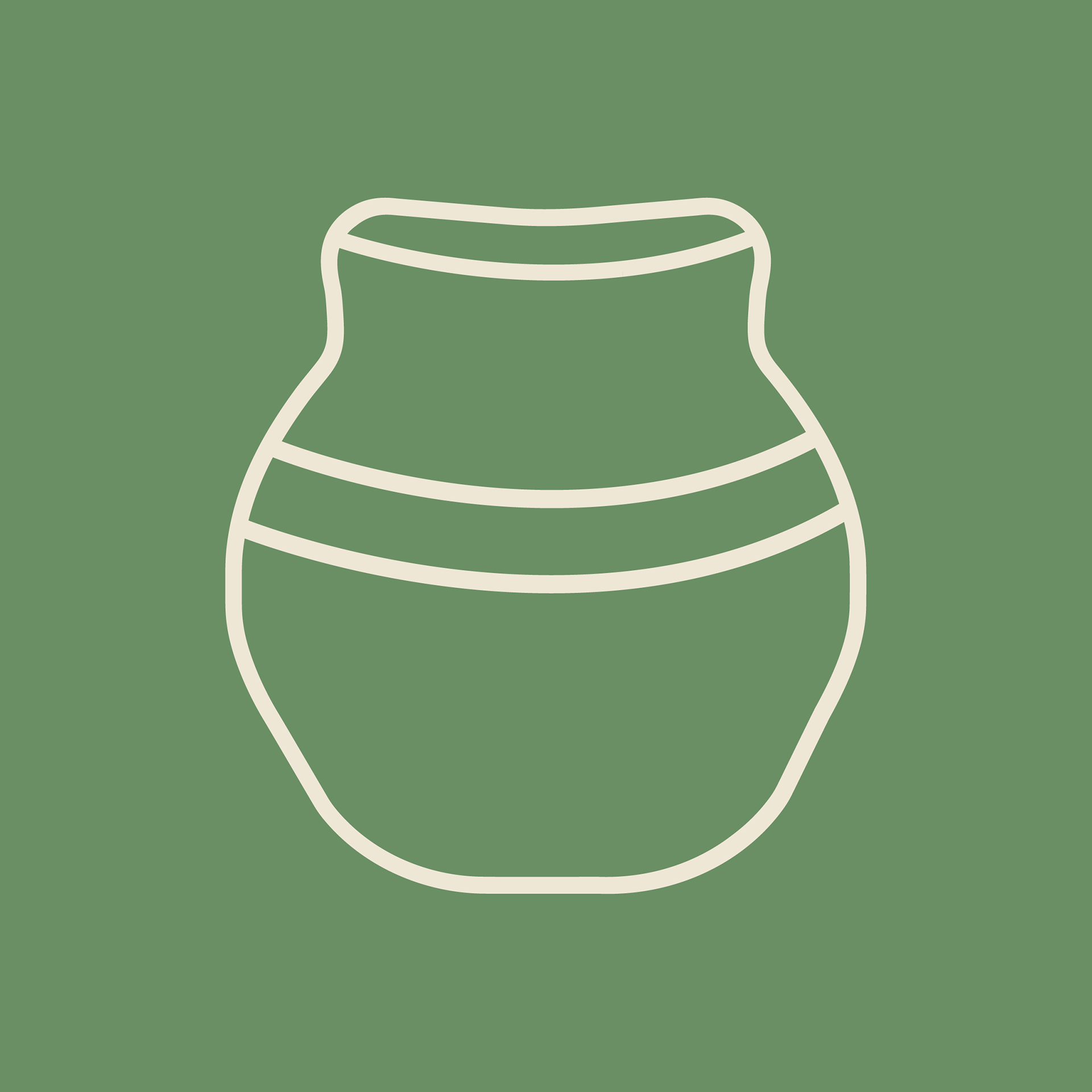
Previous ceramic pot icon.
Client’s Vision for Rebranding
While the client appreciated the simplicity of the original minimal logo, she recognised the need for a design that was both more impactful and scalable. She wanted to avoid being perceived as just another small business using Canva templates and unlicensed fonts, which could lead to legal issues as the brand grows. The objective was to retain a clean aesthetic that reflects the owner's personality while maintaining relatability for a broad audience.
THE BRIEF:
Responsive Logos
ReTouch Current Icon
Colour Palette
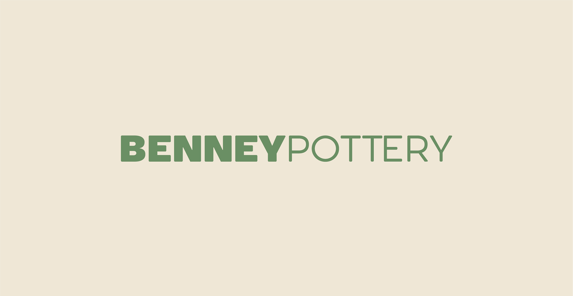
Typography
Mascot
Business Card
Must be minimal with muted tones


Previous logo and branding material
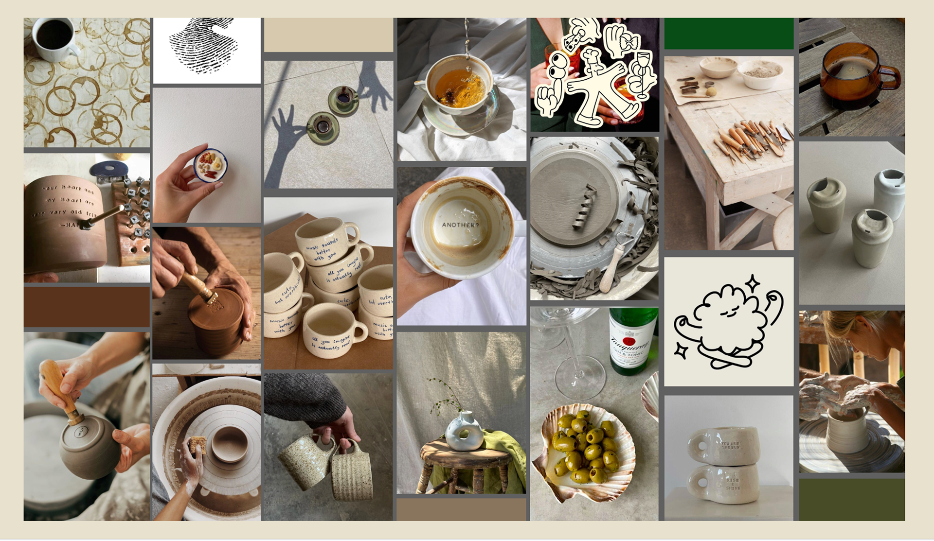
Approved Mood Board for Brand Direction
First Design Concept


The client liked the concept but felt like the font was almost too girly and too busy with two different fonts. The fingerprint concept for the icon was beautiful, however it would not translate well when used as a stamp for ceramics. The finer details would easily be blurred, leading to potentially wasted products due to poor quality control.
So... back to the drawing board

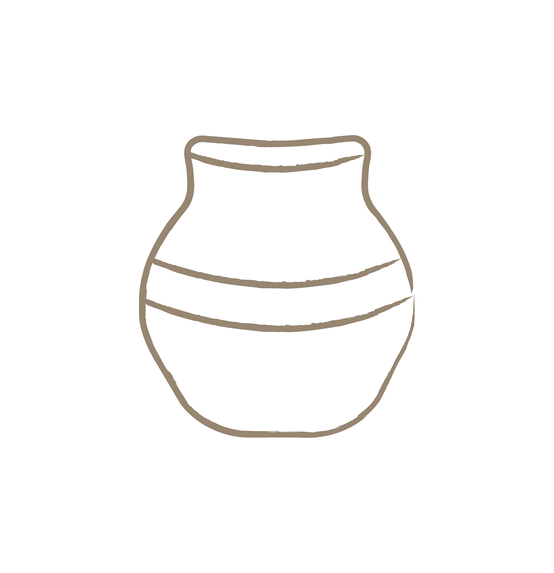
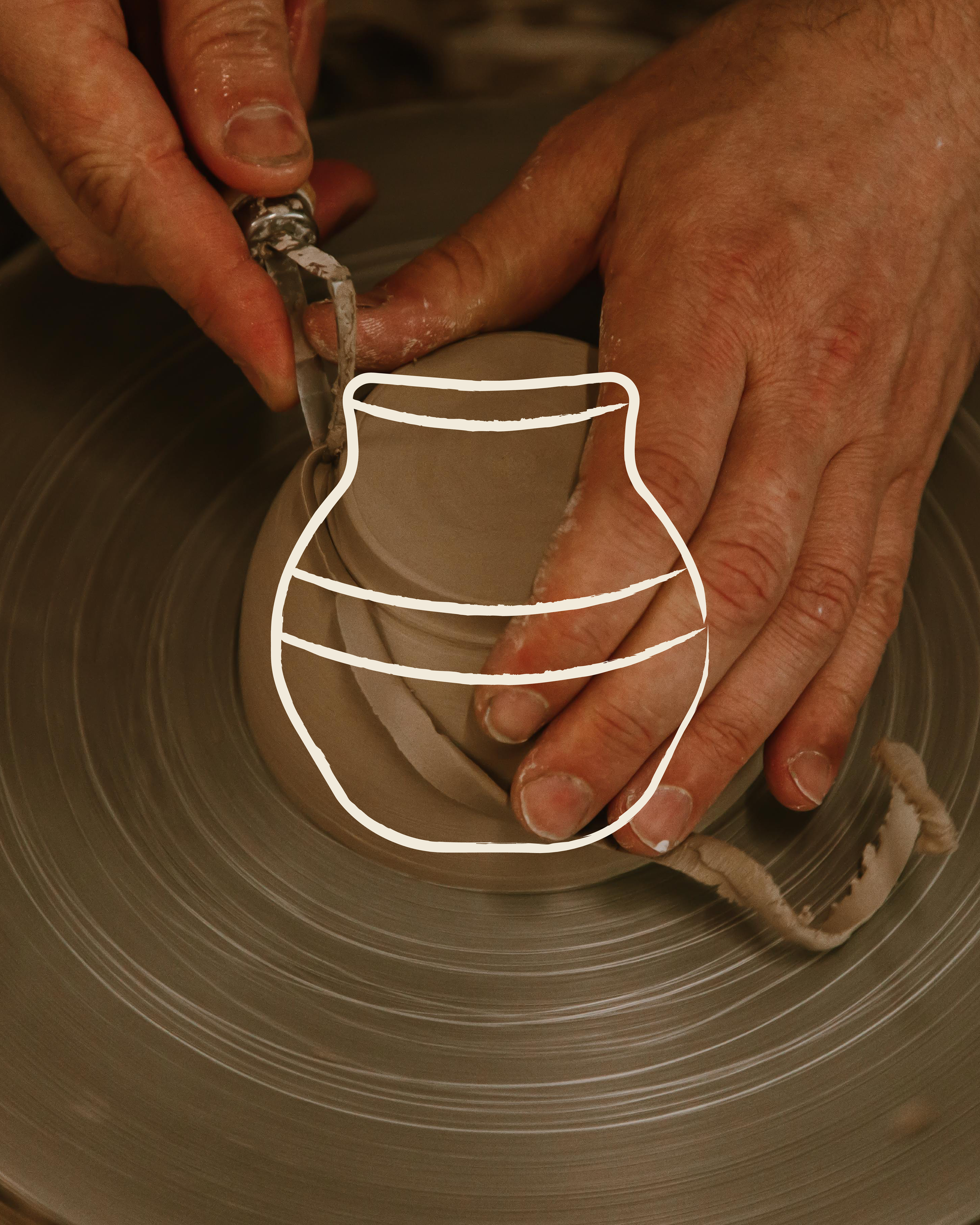
Inspiration For Icon
To build a personality for the brand, I used this pot as inspiration since the owner felt deeply connected to it (because this was the first pot she had ever made). This made it the perfect starting point of design, and it will be the difference between a deeply connected brand VS another generic business with no heart.

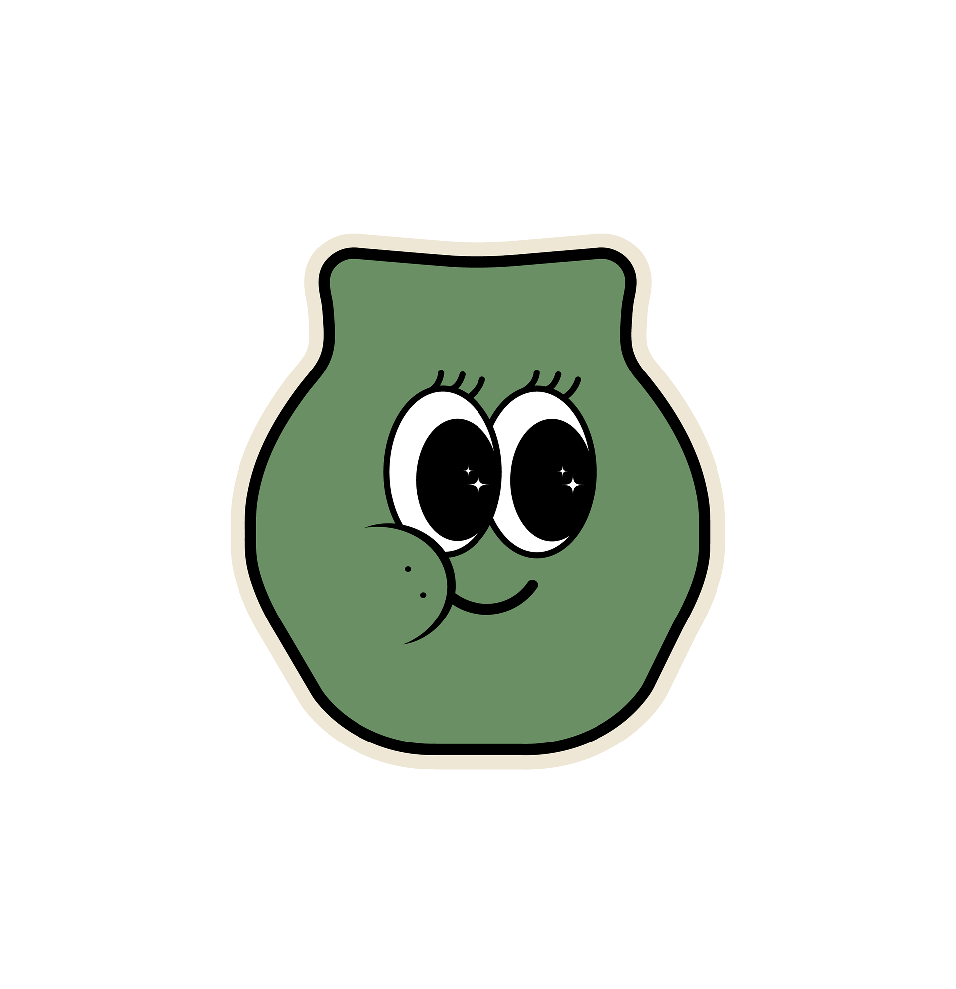


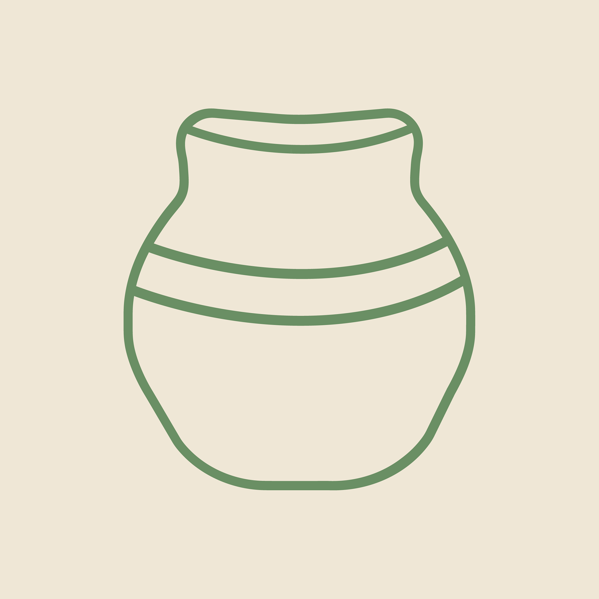

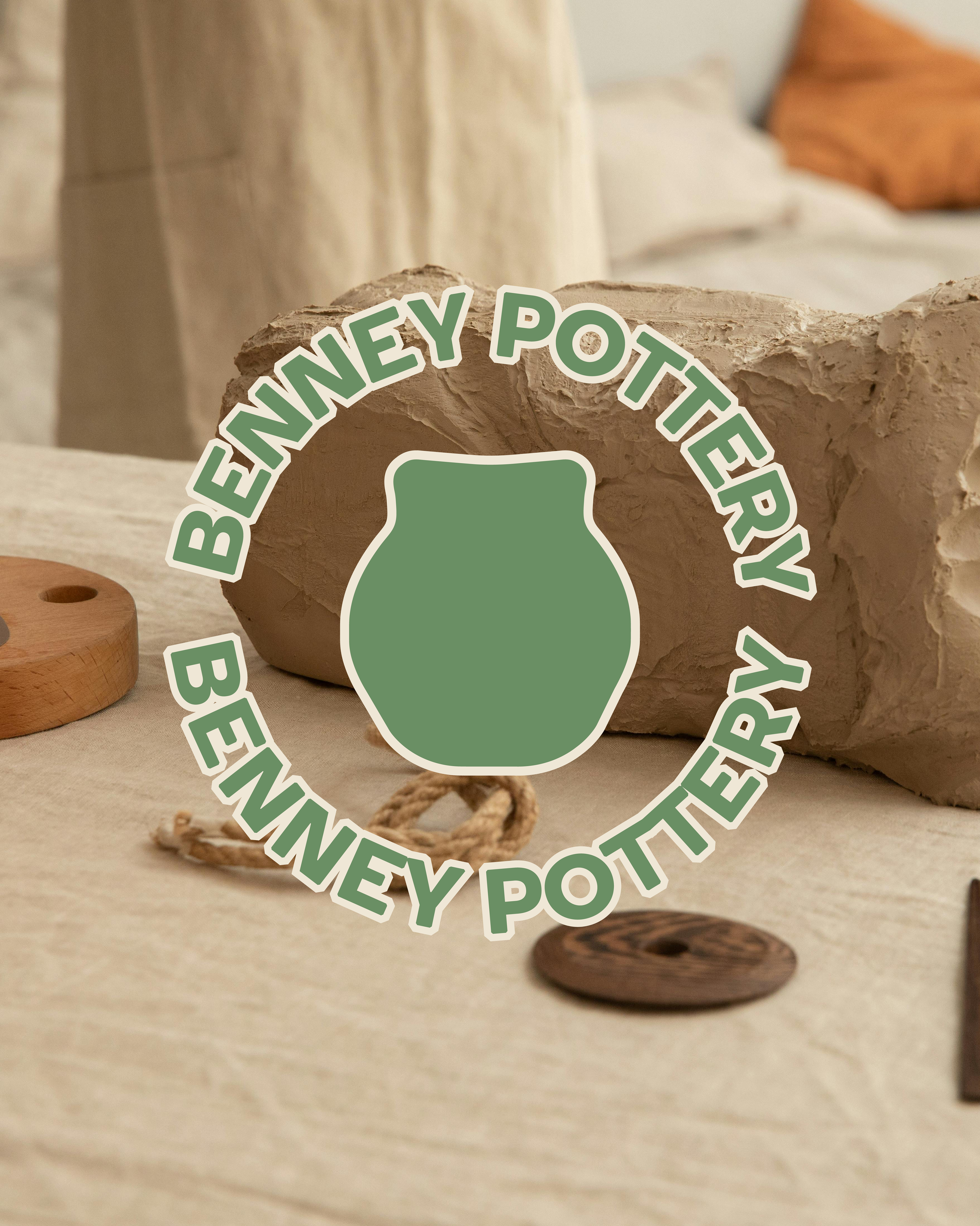

Approved Logo & Mascot Designs
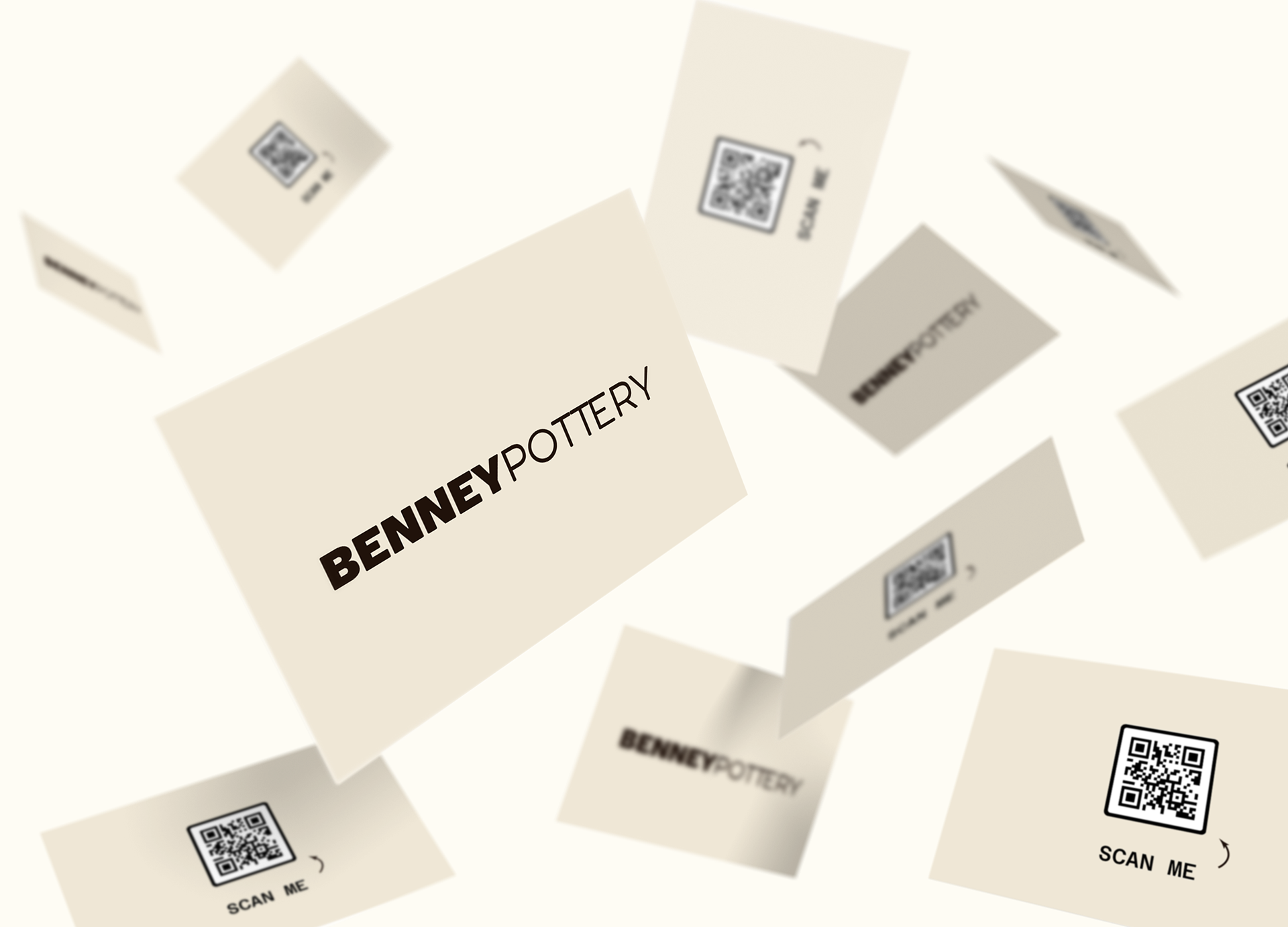
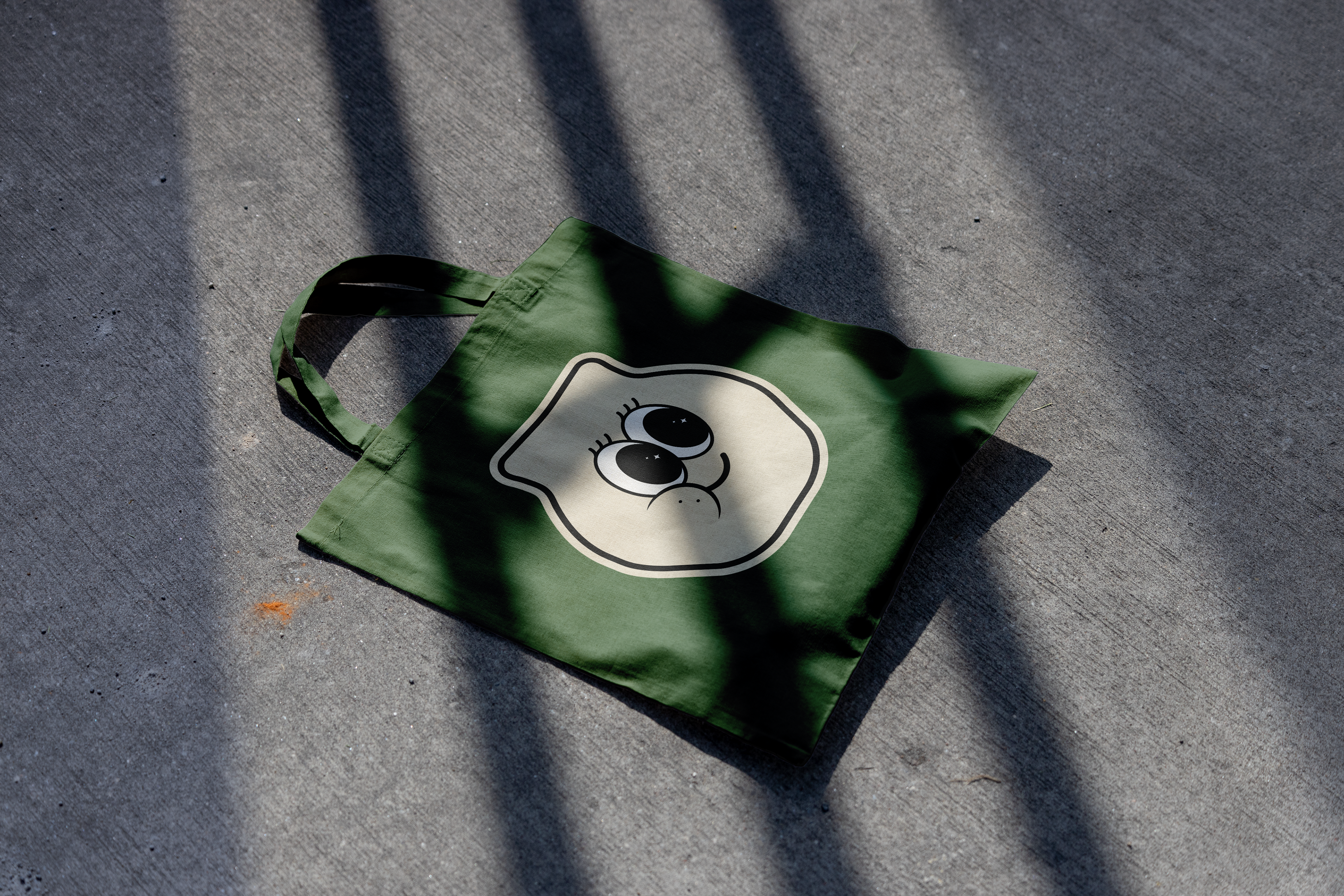

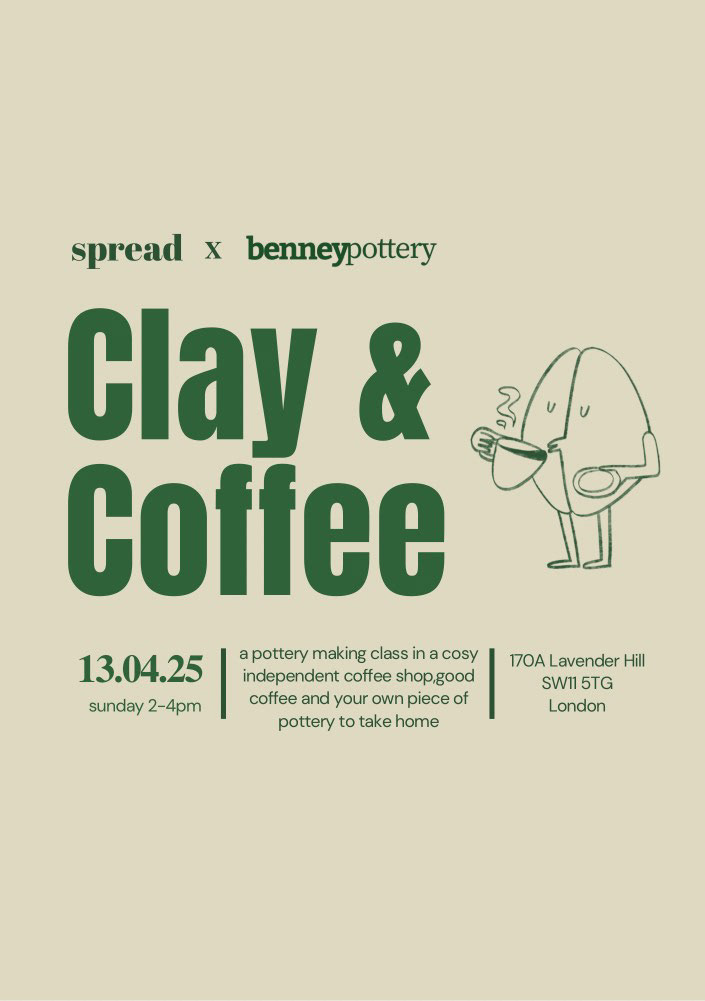
Branding in Action

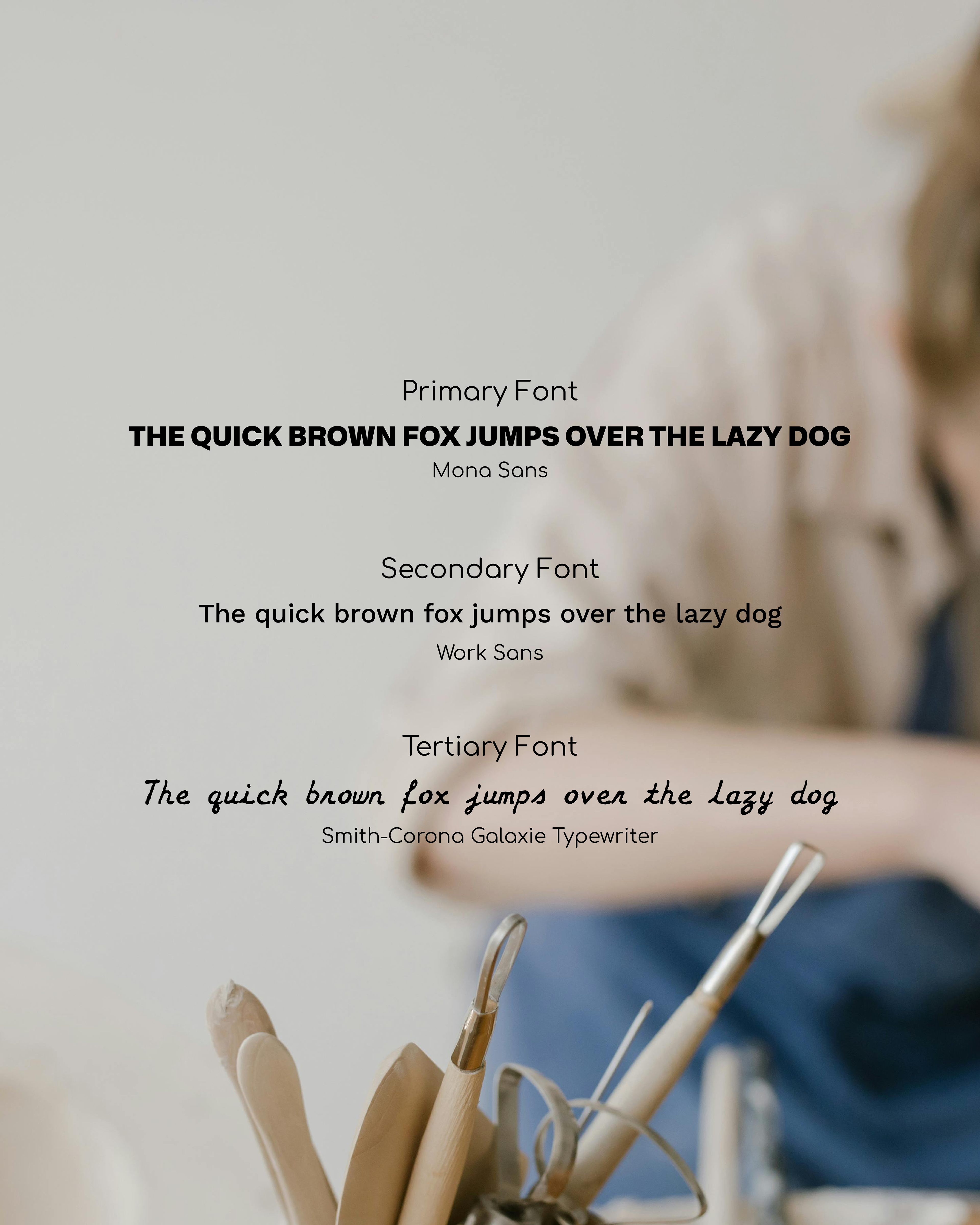
Colour Suite & Typography Suite
#20120A – Deep Espresso Brown
This brown represents fired clay of handmade ceramics and the richness of freshly brewed coffee which are both essential to Benney Pottery’s artisanal, earthy identity.
This brown represents fired clay of handmade ceramics and the richness of freshly brewed coffee which are both essential to Benney Pottery’s artisanal, earthy identity.
#7B5E3F – Warm Clay Brown
Feels like sun-dried terracotta/the warmth of pottery just pulled from the kiln. It brings character and depth, adding warmth without overpowering the minimal aesthetic.
#D9C9B0 – Clay Beige
This neutral beige resembles the tones of unglazed stoneware or dried slip. It’s calm, understated and perfect for letting products or text shine and acts as the subtle backdrop for storytelling.
#EFE7D6 – Bone White
Inspired by fine ceramic glaze or sun-bleached surfaces, this shade offers brightness without harshness. It creates clean, breathable layouts that reflect the calm environment you’re building
#1E3F1F – Olive Bark Green
Inspired by the rich tones of traditional ceramic pottery, this green mirrors the hues of olive ash glazes and unpolished clay. It brings an earthy, handcrafted quality to your palette.
#54744F – Sagewood
Drawing from the gentle tones of celadon glaze and sun-faded foliage, Sagewood brings a soft and organic feel that’s rooted in the world of handcrafted ceramics
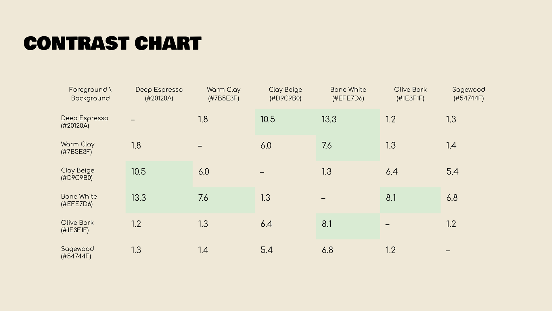
Contrast levels measure how much difference there is between two colours (usually text and background). It’s especially important for readability. The higher the contrast, the easier it is for people ( including those with visual impairments ) to read and interact with your content.
Levels above 7.1 have excellent readability, meaning they are fully accessible and ideal for body text and fine details. Anything above a 4.5 meets the minimum standard for readability. Making over half of the palette extremely well-suited pairs used for marketing materials, and the remaining colours will be used as accents to give some dimension to the designs.